Search image
Visual Search
Find similar products using an image.
upload

Upload

Drag and drop image
Recent Searches
Clear
Recent Products
Suggestions
Marble & Gold Inlay Frames
In Frames
Total Results (22)
View all frames
Cart
Categories
Uncategorized

Fall Home Decor Ideas: 25 Ways to Style Every Room for Autumn

Fall Home Decor Ideas: 25 Ways to Style Every Room for Autumn

September 15th 2026

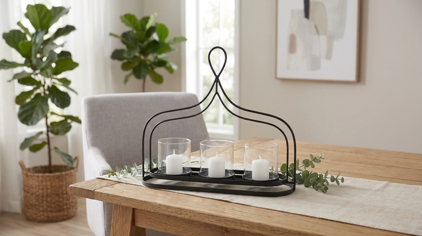
Black metal candle caddy holding three votives on dining table

Autumn changes your rooms before you do. The sun sits lower, the days shorten, and the light that made a room work in July goes flat by mid-October. Nothing moved. It just stopped landing the same way.

That is what fall home decor ideas are really answering. The warmth has to come from the objects now, and color alone will not carry it, whatever the catalogs suggest. Texture, natural material, and lamplight will.

Below are those three layers in the order that matters, plus 25 fall decor ideas room by room. Every piece shown is one we make at Sagebrook Home.

Key Takeaways

  • The best fall home decor ideas work in three layers: texture, then natural material, then warm light. Order beats quantity every time.
  • Store a real pumpkin for two to six months in cool, dark storage at 50 to 60°F. If it sits in a heated living room, expect two to four weeks.
  • Drying your own stems takes one to three weeks, hung upside down somewhere cool and ventilated. Start in September if you want them for October.
  • Amber, burnt orange, and olive sit together naturally, since those are the pigments left in a leaf once the chlorophyll breaks down.
  • Keep any candle at least 12 inches from what can burn. Dried stems are flammable, which matters most on a mantel.

How Do You Decorate Your House for Fall Season?
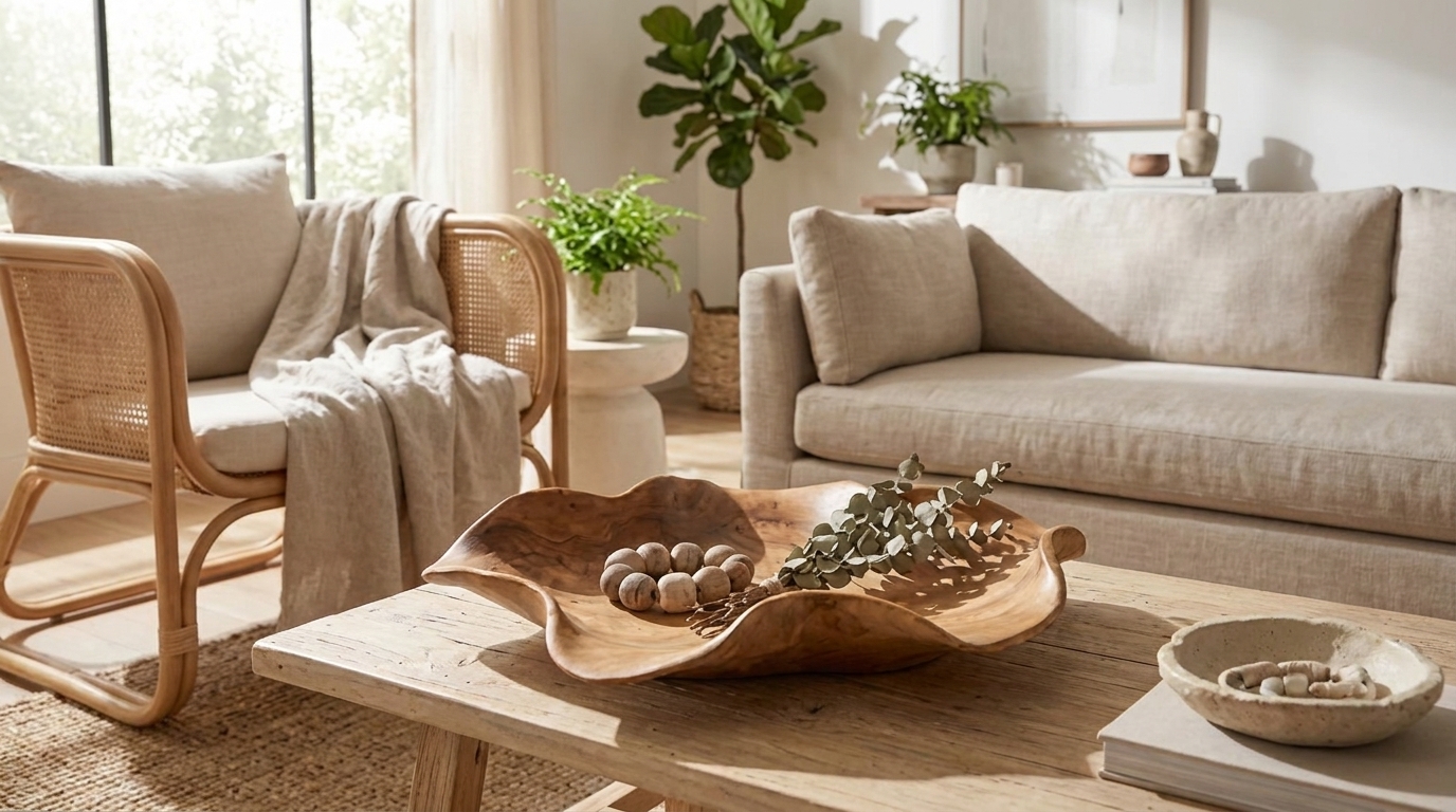
Carved wooden bowl with eucalyptus and decorative beads on table

Decorate your house for fall in three layers, working in order. 

Swap lightweight summer textiles for knit, wool, or velvet. Then group pumpkins, gourds, or dried stems in two or three places instead of scattering them everywhere. Finally, warm the light with soft-white bulbs and candles.

Order matters because each layer needs the one before it. Texture is what you feel before you notice anything, so it costs the least and does the most. Natural elements only read as deliberate in groups. 

Light is what most fall home decor advice skips, and it is what sells October after dark.

The 3-Layer Method for Fall Home Decor

Work the layers in order. Skipping to layer two is why a room full of pumpkins can still feel wrong.

LayerWhat it doesWhat to buyThe mistake
1. TextureChanges how the room feelsKnit throws, wool, velvet, bouclePumpkins on summer linens
2. NaturalGives the season its shapePumpkins, gourds, dried stemsSmall objects spread thinly
3. Warm lightReads as autumn at nightSoft-white bulbs, pillars, hurricanesOne overhead light doing it all

Layer 1: Texture

Change what you touch before you change what you look at.

So start with the cushions, swapping linen covers for wool, bouclé or velvet. Then drape one chunky knit over the arm of the sofa, and do the bed while you are at it, well before you go near the mantel. 

Heavier fabric shifts a room faster than anything you put on a shelf, since you feel weight and warmth long before you clock the color. Leave the summer linens up, though, and they will quietly fight every pumpkin you set down.

Layer 2: Natural Elements

Group, never scatter.

Three pumpkins in clearly different sizes on one surface will beat nine spread thin across four rooms. So build two or three groupings per room, then leave every other surface completely bare, however tempting that empty console looks.

Scale decides the rest. An arrangement should read about one and a half times the height of its vase, which means a 17-inch vase wants stems reaching roughly 26 inches. Wheat, eucalyptus, dried grasses, and bare branches all hold that height without water.

Layer 3: Warm Light

Nobody skips a pumpkin, but almost everyone skips the light. Yet it is the layer of fall home decor that makes a room read like October after dark.

So move the light down to seated height with lamps, not one ceiling fixture, then choose bulbs labeled soft white. 

Check the lumens too, since soft white sets the color while lumens set the brightness. ENERGY STAR matches an old 60-watt bulb to 800 lumens and a 40-watt to 450, so going under that leaves you dim rather than warm.

Then add flame. Our candle holders cover pillars, tapers, and hurricanes, though the U.S. Fire Administration reports 20 home candle fires a day and asks for 12 inches from anything that burns.

25 Fall Home Decor Ideas, Room by Room
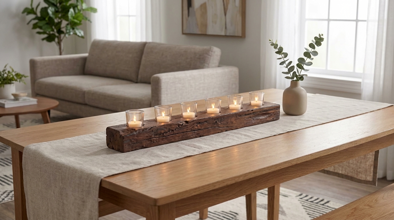
Reclaimed wood beam candle holder centerpiece on dining table runner

Every idea below names the object and the one thing that goes wrong with it, because that second part saves you the return trip. Start with the rooms you sit in. 

The living room and the mantel are where you spend October evenings, so they repay the effort. The hallway can wait.

Fall Mantel Decorating Ideas (1 to 5)

Most fall mantel decorating ideas fail the same way. Everything lands at one height, evenly spaced, and the whole shelf goes flat.

  1. Go asymmetric. Weight two-thirds of the arrangement to one side, then leave the last third genuinely bare. Symmetry photographs well, which is why you see so much of it, though in a real room it just sits there. Build the heavy end from candle holders in stepped heights, not matched pairs.
  1. Vary the candle heights. One family in two sizes does the work for you. The 13-inch and 8-inch brown holders sit roughly a third apart, which is exactly the step your eye needs. Matched heights read as a fence, so buy two sizes rather than the same one twice.
  1. Add one anchor object. Every mantel needs a piece with real mass at the tall end. A 21-inch brown lantern does it, and at that scale nothing else has to work hard. Two anchors compete, though, so a second one belongs elsewhere in the room.
  1. Run a garland along one edge. Eucalyptus or dried wheat trailing off one corner, never draped across the middle. A centered garland flattens everything behind it and fights the asymmetry you just built. Keep the stems loose enough to see the mantel underneath, since the shelf is part of the look.
  1. Work around a TV above the fireplace. A screen changes the math. Keep everything under it low and horizontal, then put your height at the far end where it clears the frame. A 27-inch-long, 5-inch-tall holder works here. Tall objects beside a screen only make the television look bigger.

The Entryway (Ideas 6 to 9)

Your entryway sets the tone before anyone takes their coat off, which is why these four fall decor ideas punch above their cost.

  1. A wreath with one dominant material. Pick dried wheat, preserved eucalyptus, or bare twigs, then commit fully. Mixed materials read as busy from the street. Inside the door, echo that single texture with a woven seagrass vase so the two read as one thought.
  1. A bowl of gourds on the console. Height makes this work, so choose a pedestal form over a flat dish. An 11-inch-tall wooden bowl lifts gourds into view, while the wider 14-inch teak bowl suits a deeper console. Flat dishes on low tables vanish.
  1. Baskets for the overflow. Boots and umbrellas need somewhere to go, otherwise they colonize the surface you just styled. One large woven storage basket under the console handles it, and a shallow tray above catches keys. Two baskets side by side, though, and the entry reads as a storage aisle.
  1. Light the door, not just the mat. A doormat is the cheapest change in the house, though coir fades within six weeks of direct sun. A 21-inch brown lantern beside the door lasts all season and works after dark, when the mat does nothing.

Fall Home Decor Living Room Ideas (10 to 14)

Most fall home decor living room advice opens with a pumpkin on the coffee table. Start with the sofa instead, since that’s what you actually touch.

  1. Swap every cushion cover. Wool, bouclé, or velvet in place of linen, and do all of them rather than half. Two colors carry a room, whereas five turn it into a swatch board. Fabric is the layer you feel before you see, so it shifts a room fastest.
  1. Tray the coffee table. Four scattered objects become one composition the moment they share a border. A 20×17-inch wooden tray does that on most coffee tables. An empty tray still looks empty, though, so give it two objects at different heights and stop.
  1. One stem arrangement with height. Dried grasses need weight underneath them, so the vase matters more than the stems do. A tall glass vase holds them without tipping. Keep stems at least half the vase height; otherwise, the whole thing looks docked.
  1. Stack books with an object on top. Stack three hardcovers with the jackets off, then place one ceramic accent on top. That stack lifts a small object to a height it could never reach alone. Past four books, though, and you have storage rather than styling.
  1. Move a lamp to the far corner. Two lit corners beat one bright ceiling, because the light then falls where you sit rather than where you stand. A table lamp does it. Watch the shade, since anything above seated eye level glares straight at you.

Fall Table Decor Ideas for the Dining Room (15 to 18)

Fall table decor ideas live or die on one rule. Nothing blocks eye contact, so keep the center under 12 inches or make it tall enough to see beneath.

  1. A runner in a heavier weave. Linen in July, wool or slub cotton by October, since weight is what actually reads as seasonal on a table. Keep the runner under a third of the table width, otherwise it crowds the settings, and your guests eat off the edge.
  1. A low, long centerpiece. Length beats height here. A 24-inch gold holder standing just 4 inches tall runs the length of the table and sits far below anyone’s sightline. Round centerpieces waste a rectangular table, leaving both ends bare while the middle crowds.
  1. Taper candles, unlit at lunch. Tapers give you height without bulk, and they read as autumn before anyone lights them. Set them in taper holders at two heights. Store them flat, though, because tapers lean in a warm room and a bent candle undoes everything.
  1. One object per setting. A small gourd, a eucalyptus sprig, or a single leaf on each napkin. Repetition does the work here, so keep every setting identical. Anything a guest has to lift and move before eating is clutter, no matter how good it looked while you were laying it out.

The Kitchen and Bedroom (Ideas 19 to 22)

Two rooms most fall decor ideas skip entirely, even though you use both every day.

  1. A fruit bowl worth looking at. Pears, figs, and small squash read as autumn in a way apples never will. Give them width rather than depth, so a 24-inch-wide bowl shows everything at once, while a deeper 16-inch bowl suits smaller counters. Keep it edible, otherwise it quietly rots.
  1. Tea towels in a seasonal weave. Two minutes of work and no storage cost afterward, making this the highest-return change in the house. Buy two sets though, since one always lives in the wash. Hang them where you see them, not folded away in a drawer.
  1. Heavier bedding and one throw. The biggest seasonal change in the house, and the one nobody photographs. Add weight to the bedding first, then let a single throw fall at the foot. A neatly folded throw looks staged, so drop it and leave it alone.
  1. Warm bedside light. Overhead light is wrong in a bedroom in every season. A table lamp at seated height fixes it, and a small lantern beside it covers the last hour before sleep. A dimmed ceiling fixture is still overhead, so it still flattens the room.

The Porch and Front Door (Ideas 23 to 25)

  1. Pumpkins staggered on the steps. Odd numbers, three clearly different sizes, all weighted to one side. Rain is the real enemy, since pumpkins soften fast on wet stone. Lift them onto a planter or a plain board, and you buy yourself weeks.
  1. A larger wreath than feels right indoors. Doors read from the pavement, so size up past what looks correct in your hallway. Sun is the catch here, because a wreath in full afternoon light fades on one side only, and uneven fading looks worse than even.
  1. Planters with mums or ornamental cabbage. Living color that holds past the first frost, and the only idea here that keeps growing after you buy it. Choose planters bigger than the nursery pot, though, since mums in small pots dry out in two days.

Fall Color Palettes That Actually Work Together
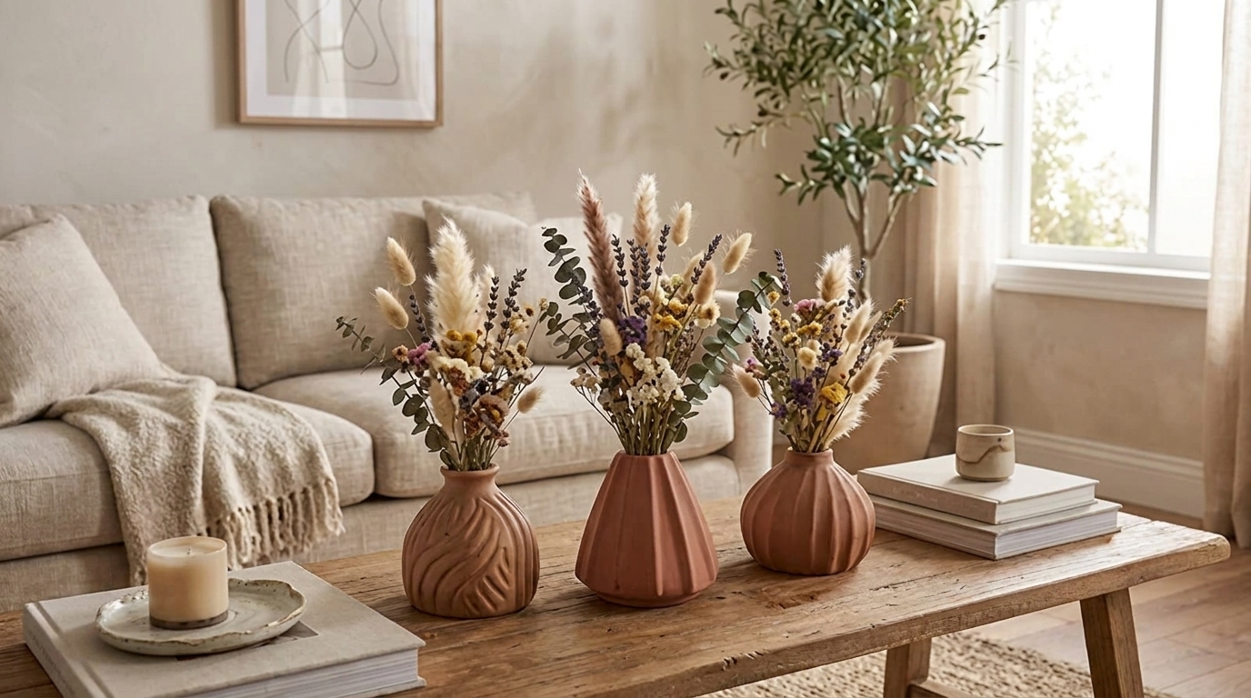
Terracotta vases with dried fall florals styled on coffee table

That autumn palette is not a marketing invention. According to SUNY College of Environmental Science and Forestry, the yellows and oranges sat in the leaves all along, masked by green until chlorophyll fades. 

Reds come later, with cold. Amber, burnt orange, and olive agree because they share the same chemistry.

Three that hold up indoors:

  • Warm neutral. Oat, camel, terracotta, one black accent. The rustic fall home decor default, and it carries into winter.
  • Deep and moody. Olive, oxblood, bronze, warm chocolate. Skip the light layer, and it goes flat by six.
  • Quiet and modern. Soft white, wheat, pale gray, one amber note. Modern fall home decor at its cleanest, anchored by Pantone’s 2026 Color of the Year, Cloud Dancer.

Real vs Faux: What Actually Lasts

Every fall home decor roundup tells you to use real pumpkins and dried stems. Almost none says how long they last, which is what decides what you buy.

Illinois Extension puts whole, unblemished pumpkins at two to six months in cool, dark storage at 50 to 60°F, off the floor and away from ripening apples, whose ethylene cuts that short. Your living room meets none of those conditions, so plan on two to four weeks and keep spares in the garage.

Dried stems go the other way. UF/IFAS Extension says air-dried material lasts almost indefinitely, taking one to three weeks to dry, hung upside down somewhere cool and ventilated. Never rush it with a heater, though, because dried plant material is highly flammable.

ItemReal lifespan indoorsBuy faux?Why
Pumpkins2 to 4 weeks indoorsFor the display groupFaux holds shape all season; keep one real
Dried stemsSeveral seasons if kept dryNoReal grasses cost less and look better
Garlands1 to 2 weeks freshYesReal eucalyptus curls and drops within a fortnight
Gourds3 to 8 weeksMixedSmall gourds last longest; mix real and faux
Wreaths4 to 6 weeks outdoorsYesWeather and sun do the damage

What Month Should You Start Decorating for Fall?

Start decorating for fall in the second half of September. That leaves six weeks before Halloween and ten before Thanksgiving, which is long enough to be worth the effort and short enough that nothing wilts before guests arrive.

Timing then splits by what you are buying:

  • Textiles and dried stems. Buy anytime, since neither degrades.
  • Anything living. Late September. A pumpkin bought on the first is past its best by mid-October, exactly when you want it looking good.
  • Fall table decor ideas. Hold until the week you host.

How to Carry Fall Decor Through Halloween

You need one swap, not two sets of decorations. The textiles, dried stems and neutral vessels stay put from late September into November, doing quiet work the whole time.

Then, for the last ten days of October, change the objects on the tray, drop black or deep orange into one grouping per room, and keep anything genuinely spooky by the front door where it belongs. Our Halloween decorating ideas go further on that.

Come November 1st, strip the black and the carved pumpkins in one pass, ideally before coffee. The fall decor ideas underneath carry you straight to Thanksgiving.

Conclusion
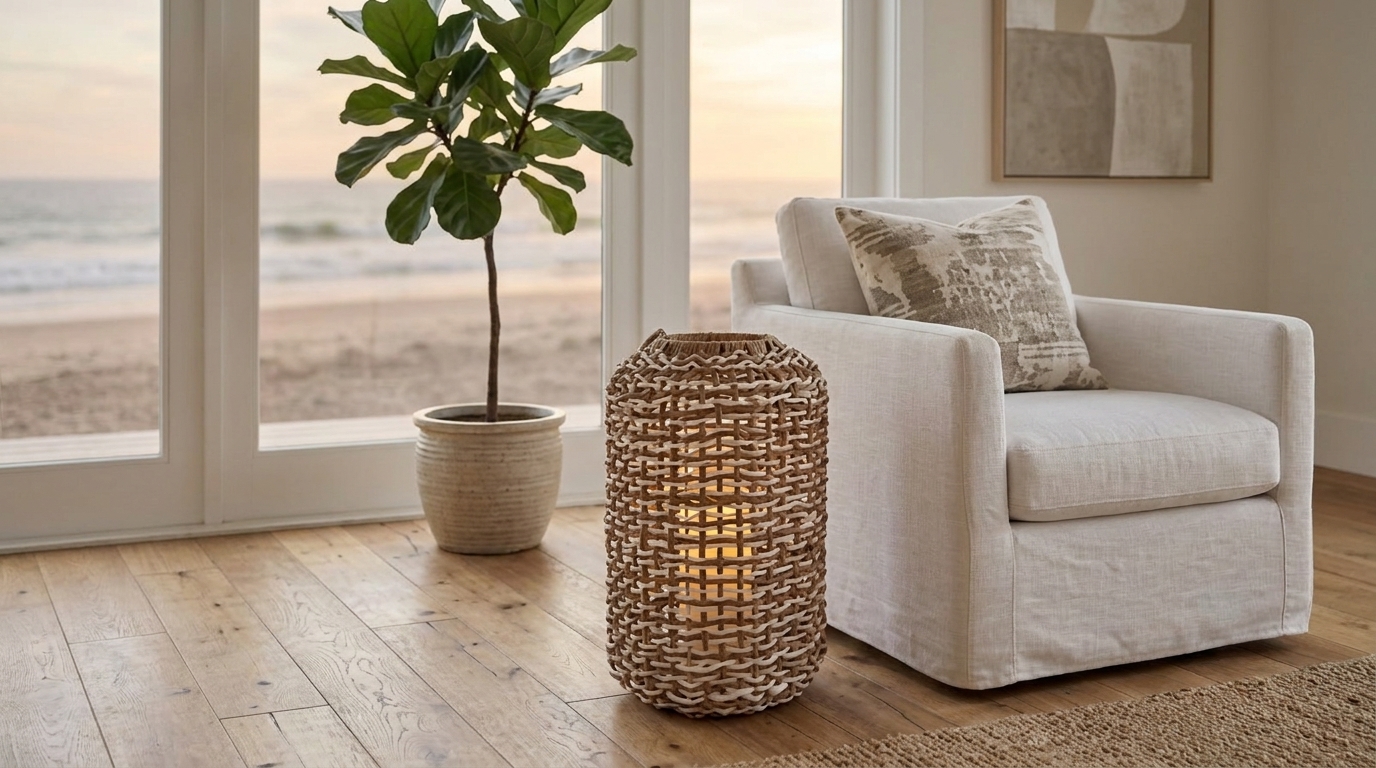
Woven rattan floor lantern glowing beside armchair with ocean view

Walk into your main room this week and ask one question: has anything changed that you can actually feel?

If the cushions are the ones that were there in July, start there. Leave the pumpkins in the box a while longer, because texture and light do the real work, and neither shows up in a photograph. When you are ready to build, our decorative accessories hold a grouping together, our vases take branches, and our candle holders cover the last layer.

FAQs

How do you store fall decor so it lasts until next year?

Store it dry and off the floor. Wrap ceramics in paper rather than plastic, which traps moisture, and lay dried stems flat in a box instead of standing them in a vase. Loft heat and dampness ruin fall home decor between seasons.

How long do real pumpkins last as decoration?

A whole, unblemished pumpkin keeps two to six months in cool, dark storage at 50 to 60°F. In a heated room, expect two to four weeks, and a carved one three to five days. Never carry a pumpkin by its stem, since a broken stem invites rot.

How do you dry your own stems and grasses for fall decor?

Cut stems at midday, strip the lower leaves, tie them in loose bunches, then hang them upside down in a cool, dry, well-ventilated room. Allow one to three weeks. Skip the heater, since forced heat is a fire risk and drains the color.

What are the best fall mantel decorating ideas for a small mantel?

Work asymmetrically. Weight two-thirds of the arrangement to one side, leave the last third bare, and step your candle heights down by a third each time. The best fall mantel decorating ideas for a short shelf use three objects, not six, and one tall anchor.

What is the difference between fall decor and Halloween decor?

Fall decor is seasonal and neutral: texture, natural material and warm light that work from September to November. Halloween decor is thematic and dated, so it reads wrong on November 1st. Treat Halloween as ten days of swapped objects sitting on top of the fall layer.

How do you make fall decor look elegant instead of cluttered?

Limit yourself to two or three groupings per room and leave every other surface empty. Hold to two colors plus one accent, repeat one material across rooms, and vary heights within each group. Elegant fall home decor living room setups always have fewer objects.
Categories
Uncategorized

Console Table Decor: 21 Ideas for Entryways, Hallways and Living Rooms

Console Table Decor: 21 Ideas for Entryways, Hallways and Living Rooms

September 15th 2026

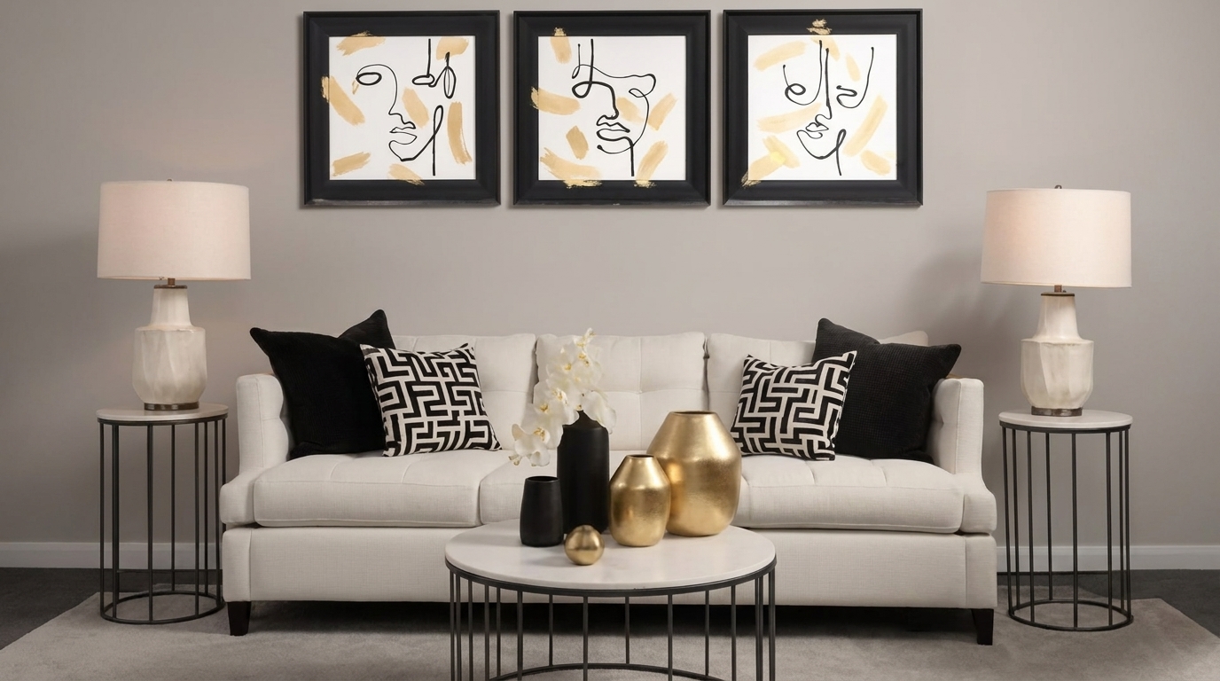
Black and gold console styling with triptych line art above

Most console tables fail on measurement, not taste. The vase looks good. The tray looks good. Together they look off, because nothing on the surface is sized against anything else.

Strong console table decor starts with numbers, then style: art at two-thirds the table width, a 57-inch centerline, odd-numbered groups at three clear heights. Get those right, and the objects stop competing for attention.

Below are 21 console table decor ideas, six rules to check them against, and the mistake each one prevents. Entryway table decor gets its own section, and every piece shown comes from Sagebrook Home.

Key Takeaways

  • Console table decor comes down to three decisions: what hangs above it, how tall the objects are, and how much surface you leave bare.
  • Hang art or a mirror that spans two-thirds of the table width, centered 57 to 60 inches off the floor.
  • Group objects in odd numbers, and keep neighboring heights at least a third apart.
  • Entryway table decor adds one rule: keep the console 12 to 14 inches deep so the walkway stays clear.
  • Leave a third of the tabletop bare. Most console tables look wrong because there is too much on them, not too little.

How Do You Decorate a Console Table?

Decorating a console table works from the top down. Hang art or a mirror spanning two-thirds of the table width, then build an odd-numbered group beneath it.

  • Start by measuring your table width, then multiply by 0.66 to find the art width.
  • Hang it centered 57 to 60 inches up, 4 to 8 inches above the top.
  • Next, place your tallest piece, a lamp or vase, off-center.
  • Drop the next object by a third in height, then add a tray or books.
  • Finally, clear objects until a third of the surface is bare.

What Is the Rule for a Console Table? 6 Rules Designers Use

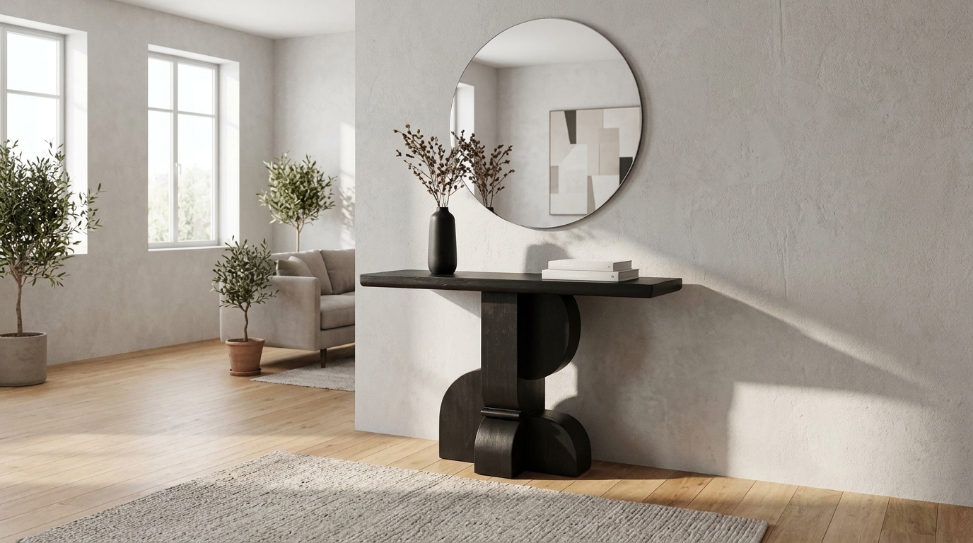
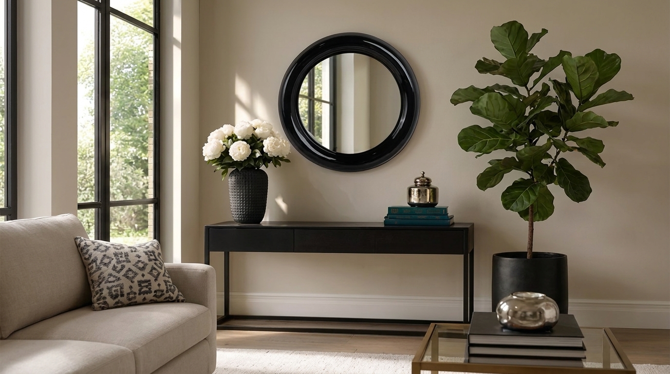
Black console table styled with round mirror peonies and stacked books

There is no single rule. According to the University of Minnesota’s Bakken Center, no design guideline holds in every case, because the room, the budget, and personal taste all change the answer. The toolkit stays the same, though: balance, proportion, rhythm, emphasis, and scale.

Six rules turn those principles into numbers, so console table decor becomes a ninety-second check instead of guesswork.

RuleWhat it governsThe numberWhen to break it
Two-thirds ruleWall piece scale66% of table widthGo narrower and taller
The 57-inch lineHanging height57 to 60 in. centreMeasure from the tabletop
Triangle ruleArrangement shape3 points, steppedLong consoles take two
Rule of threeObject countOdd numbersMatched lamp pairs
One-third heightHeight variation33% differenceA deliberate candle row
Depth ruleEntryway clearance12 to 14 in.Wide halls take 16 in.

1. The Two-Thirds Rule for Scale

Start on the wall, because scale is the first decision in console table decor. Your piece should span about two-thirds of the table width, the same ratio that sizes art above a sofa.

Our 48-inch black console therefore wants roughly 32 inches. A 36-inch round mirror still fits, since a circle covers about the same area as a 32-inch square.

Go much narrower, and the piece reads as an afterthought, which is the mistake behind most bare-looking consoles. Gallery groups count as one shape, so five tight frames spanning 32 inches work like a single 32-inch canvas.

2. The 57-Inch Line for Hanging Height

Hang your mirror or art with its center 57 to 60 inches off the floor, which is average standing eye level. Galleries work to that line, though no building code enforces it, so treat it as convention rather than law.

Low ceilings are the exception. In those cases, measure up from the tabletop and leave 6 to 10 inches of clear wall beneath the frame.

3. The Triangle Rule: Symmetrical vs. Asymmetrical

Arrange your objects so their tops trace a triangle. You have two ways to do it:

  • Symmetrical: tall pieces at both ends, low in the middle. Formal and calm.
  • Asymmetrical: one tall anchor at one end, something low at the other. Relaxed and easier to pull off.

If a mirror hangs above, go asymmetrical, since the mirror already provides symmetry.

4. The Rule of Three (and the 3-5-7 Rule)

Group your objects in odd numbers. Two matching vases pull your eye into comparing them, while three pieces of different sizes read as one arrangement you take in at a glance.

The 3-5-7 rule then sizes the group to your table. Use three on a narrow console, five on a standard one, and seven only when the table runs long. Start your console table decor with three pieces.

5. The One-Third Height Rule

Step your objects down in height, cutting at least a third each time. A 26-inch lamp, then a 14-inch vase, then a 3-inch stack of books gives your eye a clear path across the table.

Without those gaps, the group flattens. Three pieces all standing 10 to 12 inches tall read as clutter, no matter how good each one is on its own.

6. The 12-to-14-Inch Depth Rule for Entryways

Most entryway consoles are too deep for the hall they sit in. You need 30 to 36 inches of walkway to pass comfortably, and in an entry under 48 inches wide, a table deeper than 14 inches eats that margin.

One more thing before you style it. The CPSC’s Anchor It! campaign reports that 73% of child tip-over deaths involved climbing or force, so bracket the console to the wall first if kids are around.

21 Console Table Decor Ideas

Minimalist black console table with round mirror and dried branches

These console table decor ideas are grouped by the job each one does, so start wherever your table is weakest.

Anchor the Wall Above (Ideas 1 to 4)

Nothing on the tabletop looks finished until something lands on the wall behind it. Four ways to do that, and each one asks for a different width.

  1. A round mirror. Circles break up all those right angles, and in a dark hall a mirror is the cheapest light you will ever buy. A 36-inch black round mirror reads correctly over a 48-inch console, since a circle carries less visual width than it measures. The catch: above a long console it looks marooned, so flank it with a table lamp.
  2. One oversized piece of art. It’s the fastest finish there is, and it asks nothing of your arranging skills. Width is the only real decision. A standard console takes something like this 32-inch-wide ivory piece, while a long one carries a 63-inch black landscape work without strain. The catch: tape a paper template up before you drill.
  3. A matched set of three. Three panels in one finish hang as a single rectangle, which is why a pre-matched black three-piece set beats frames you gathered separately. The catch: it spans 83 inches, so measure the wall before you fall for it.
  4. A mirror with pattern instead of scale. Some walls need texture rather than size. The 28-inch gold weave-like mirror brings pattern without adding color, and it ships with its own mounting hardware. The catch: keep everything below a busy frame plain.

Build the Tabletop Layers (Ideas 5 to 10)

Work top down from here. Tallest object first, then the middle, then the low layer, because filling a gap is easier than finding one after everything is placed.

  1. A table lamp. One object doing two jobs: height and light you will actually use. Shade color affects how warm the room feels, so ivory casts a softer light than bright white. A 26-inch wood-and-iron lamp suits a standard console. ENERGY STAR notes that 800 lumens replaces an old 60-watt bulb, with 450 standing in for a 40-watt. The catch: a matched pair swallows anything under 40 inches.
  2. Branches in a tall vase. Height without visual weight, and they hold their shape for months. A 24-inch woven seagrass vase carries eucalyptus at console scale. The catch: match the neck to the stems, or heavy branches splay.
  3. A stack of books. Three or four hardcovers with the jackets off will lift a small piece to the height it needs, and they cost nothing if you already own them. Top the stack with a decorative accent. The catch: past four, it reads as storage.
  4. A tray. Nothing gathers loose console table decorative pieces into one unit this quickly. A 28×14-inch wooden tray fits most consoles. The catch: an empty tray still looks empty, so give it two objects.
  5. One sculptural object. Something with real weight, like an 11-inch ecomix bowl on feet, rests your eye between the tall and low layers. Material carries mood as well, which is why terracotta reads warm where metal reads cool. The catch: a second sculptural piece competes with the first.
  6. Candles. A 10-inch taper and pillar holder or an 8-inch round lantern does what no other console table accent can: change the room after dark. The catch: clearance, though flameless removes the problem entirely.

Make It Work as an Entryway Drop Zone (Ideas 11 to 15)

Design galleries skip this part, which is why most entryway table decor falls apart inside a week. Everything below assumes the table has a job.

  1. A catchall bowl. Keys and sunglasses land somewhere the moment you walk in, so pick the spot yourself. One of the shallow decorative bowls at the door end does it. The catch: deep bowls become archaeology.
  2. A basket underneath. Shoes, leads, umbrellas. A single woven storage basket absorbs floor clutter and keeps the surface styled. The catch: two side by side look chaotic.
  3. Somewhere to sit. Boots are easier to stand on one leg than to hop. A backless entryway stool or narrow hallway bench handles it, and how to size a seat matters more in a hall than anywhere else. The catch: a backless stool has to vanish completely underneath.
  4. A letter tray. Post arrives whether you planned for it, so give it a flat decorative tray and empty it weekly. The catch: no tray means the pile becomes the decor.
  5. Hooks beside it. Coats never live on a console. They live on the floor next to one. Three hooks at 60 inches, kept to one side, fix that permanently.

Style It for Where It Sits (Ideas 16 to 18)

Same table, three very different rooms.

  1. Against a bare wall. Let the wall carry it. Hang the largest oversized wall art the two-thirds rule allows, then hold the tabletop to three objects so nothing competes.
  2. Behind a sofa. Match your console table height to the sofa back, or sit an inch below it. Keep everything under 18 inches tall, since anything higher blocks the room from the seat.
  3. Under a TV or in a narrow hall. Depth matters here, so keep it to 12 inches and build upward instead. A tall, narrow canvas at 19 inches wide suits a tight hall. Under a screen, treat the television as the art and flank it low.

Match It to Your Design Style (Ideas 19 to 21)

The rules hold across every style. What changes is the material you spend them on.

  1. Modern and minimal. Three objects, two materials, one color family, and half the top left bare. Pantone reports that its Color of the Year for 2026 is Cloud Dancer, PANTONE 11-4201, a lofty white it describes as a calming influence, which is precisely the register this style is after. So carry that quiet through the objects too, starting with a pale ceramic vase. The catch: bare surfaces show every speck of dust.
  2. Farmhouse. Weathered wood, a woven basket, and dried stems in something heavy. Texture sells this one more than color, though the harder part is choosing which rustic textures work together. Start with a natural-fiber basket, then build the smaller pieces around it. The catch: keep signage and slogans off the table.
  3. Glam. Mirrored finishes, a crystal lamp base, a lacquered tray. Reflection needs something to reflect, so this look lives or dies on lamplight, which makes a table lamp structural here rather than optional. The catch: pick one metal and repeat it, since mixed finishes read as an accident.

How to Decorate an Entryway Table

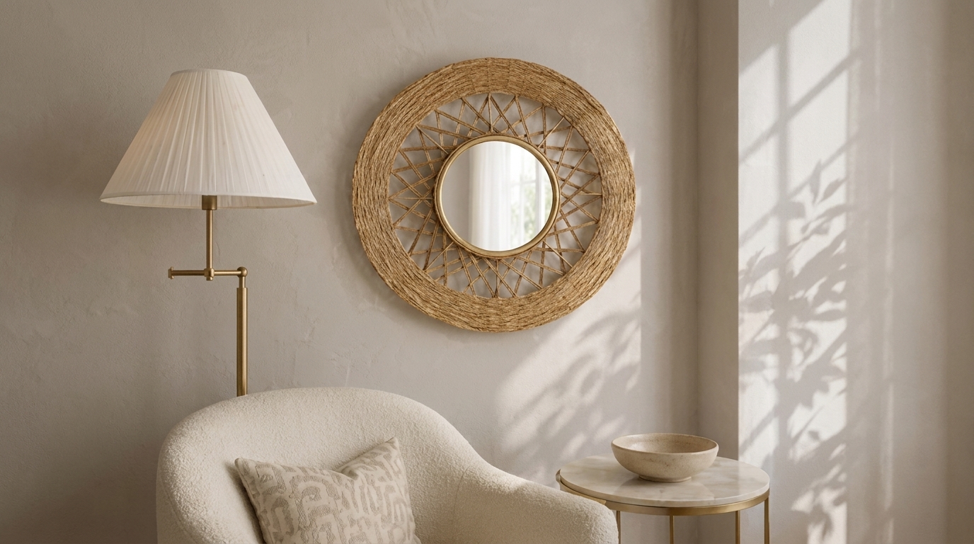
Round woven jute mirror above console in neutral living room

An entryway table wants a mirror at two-thirds its width, one tall anchor, and a shallow bowl, on a surface 12 to 14 inches deep. Most entryway table decor copies living-room styling and fails, since three constraints apply only here.

Depth comes first, because four extra inches in a 36-inch hall changes how the whole house feels. A 42-inch console at 12 inches deep solves it.

Sightline decides placement, so the bowl goes nearest the door, and the anchor goes at the far end.

Light is last. Penn State Extension measured a snake plant holding at 25 footcandles, far under the 100 usually called low light.

Seasonal Console Table Decor: Autumn and Christmas

Two seasons, three swaps, and no full restyle needed.

  • The stems in your vase. Wheat, dried grasses, and berry branches carry autumn until cedar and pine take over in December.
  • The object on the tray. A wooden bowl of gourds through October, then ornaments or brass bells once the tree goes up.
  • The candle and the textile. Amber and clove for autumn, giving way to a heavier runner for winter.

By December, though, candle count climbs, so treat clearance as styling. The U.S. Fire Administration reports 20 home candle fires a day and asks for 12 inches from anything that burns.

5 Mistakes That Make a Console Table Look Cluttered

Almost every problem with decorating a console table traces back to one of five errors, and each one breaks a rule you have already read.

  • Everything sits at the same height. Rule 5. Three objects within an inch of each other give your eye no path through the group, so it reads the whole thing as clutter rather than as an arrangement.
  • The piece above is too small. Rule 1. A 20-inch mirror over a 46-inch console makes the table look like it’s floating. Worse, an undersized piece is more damaging than a bare wall, since it drags your eye to the emptiness on either side of it.
  • The art hangs too high. Rule 2. This is the fastest one to spot, and the easiest to fix. Drop the center to 57 to 60 inches, keeping the bottom edge 4 to 8 inches above the tabletop.
  • The surface is more than two-thirds full. Rule 5 again. Here is the trap: the instinct to fix a dull table by adding one more object is what caused the problem. Take things off instead, until a third of the top is bare.
  • Nothing anchors the wall above. Rules 1 and 2, by omission. A well-layered tabletop under a blank wall still reads as unfinished, because the group has no visual ceiling to sit under.

Conclusion

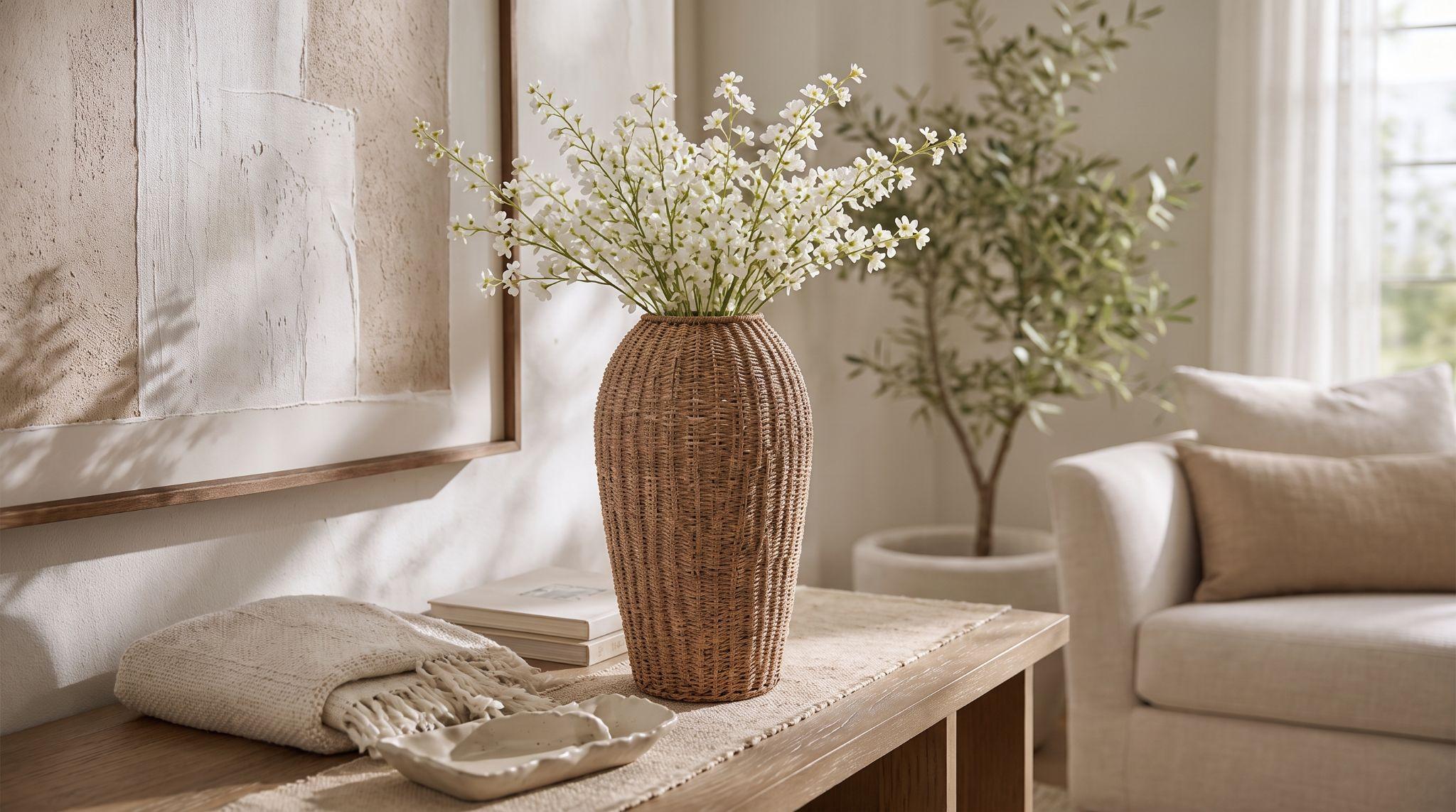
Woven vase with white blossoms styled on oak console table

Go and look at your console now. Nine times out of ten the fix is not another object. It is the wrong width above the table, or three things standing at the same height.

So measure the table, multiply by 0.66, and shop to that number, not to a photo.

We publish dimensions on every piece, which means our console tables and decorative accessories can be sized before you buy rather than returned after. Send us your measurements if you want a second opinion.

FAQs

What can I put on my console table?

Group three to five objects at varied heights: a table lamp or tall vase, a stack of books, a shallow tray, and one sculptural piece. Then leave a third of the surface bare, because good console table decor is edited. Remove one console table decorative item before you add another.

What is the 3-5-7 rule of decorating?

The 3-5-7 rule holds that odd-numbered groupings read as intentional, while even numbers read as a row. So use three objects on a narrow console, five on a standard one, and seven only on very long pieces. Matched lamp pairs are the deliberate exception.

How do you decorate a console table against a wall?

Hang art or a mirror spanning two-thirds of the table width, centered 57 to 60 inches from the floor. Then build height on one side with a lamp and balance it low on the other. Decorating a console table against a wall depends more on that wall piece than the tabletop.

How tall should a console table be behind a couch?

Match the console height to the sofa back, or sit it 1 to 2 inches below. Most sofa backs measure 30 to 34 inches, so a 28- to 32-inch console works in most rooms. Keep the table the same length as the sofa or slightly shorter, never longer.

What are the best console table decor ideas for a small entryway?

Keep the table 12 to 14 inches deep, then work vertically instead of across. Hang a mirror, add one tall vase, and set a shallow bowl at the door end. The best console table decor ideas for small halls leave the walkway clear and the surface usable.

How do you decorate an entryway table for Christmas?

Swap three layers rather than restyling everything. Swap the stems in your vase for cedar or eucalyptus, add ornaments or candles to the tray, and run one garland along the front edge. Entryway table decor ideas for Christmas work best when you keep the drop-zone basket.

Categories
Uncategorized

How to Decorate a Large Wall: 12 Ideas That Fill the Space

How to Decorate a Large Wall: 12 Ideas That Fill the Space

June 18th 2026

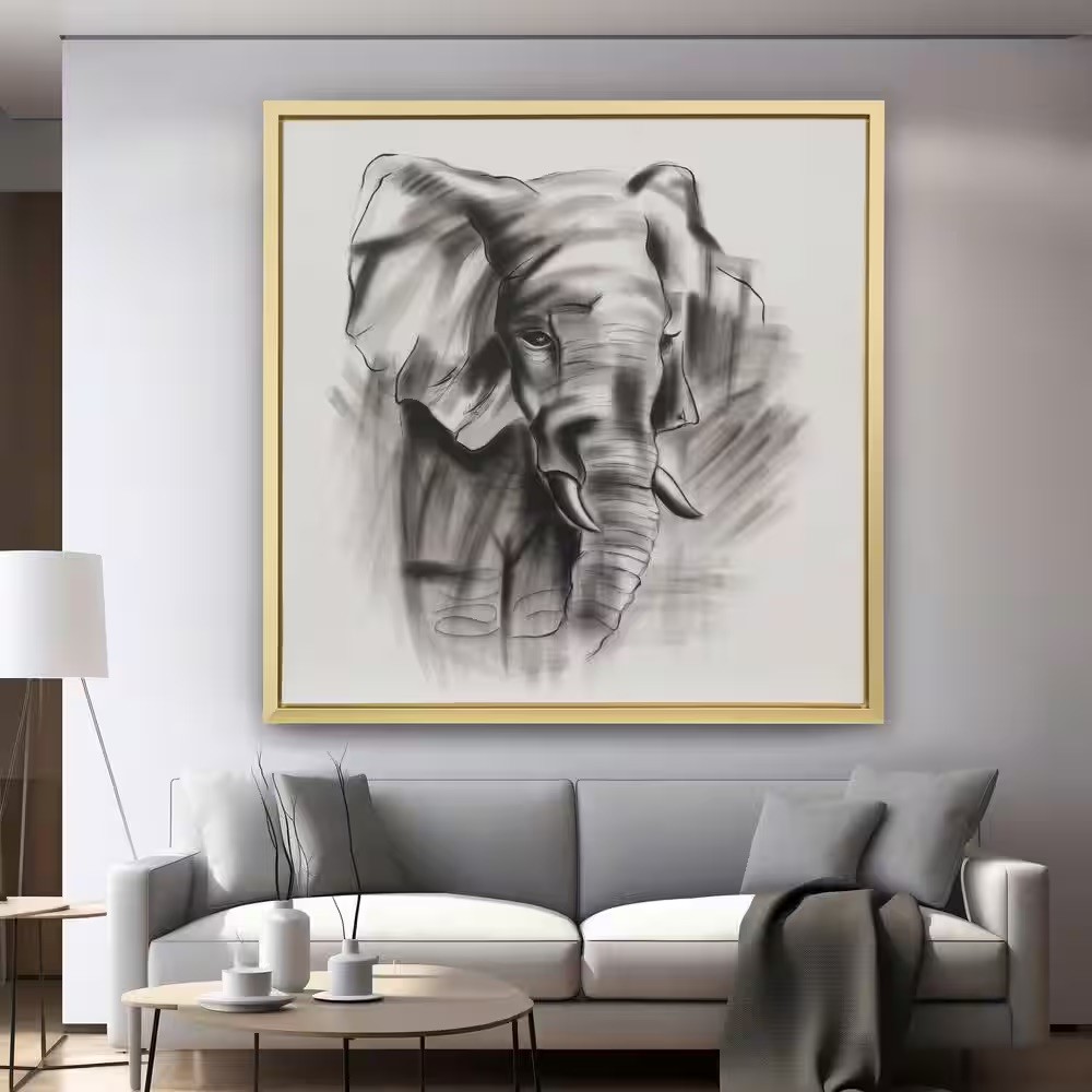
Oversized 71-inch square charcoal elephant canvas filling a large living room wall above a gray sofa

You buy the 16-by-20 print, hang it dead center, step back, and it looks like a stamp on an envelope. Almost everyone does this once. Learning how to decorate a large wall starts with a tape measure, not a shopping cart, because the fix is scale rather than quantity.

The working rule is two-thirds. Your arrangement should span roughly two-thirds the width of the furniture beneath it, which is why one oversized piece usually beats five small ones.

Sagebrook Home lists dimensions on everything, so you can size before you buy.

Key Takeaways

  • Large walls look empty because decor is undersized, not because there’s too little.
  • Learning how to decorate a large wall starts with measuring, not shopping.
  • Cover two-thirds of the furniture width below, and two-thirds of the usable wall.
  • Hang artwork centered 57 to 60 inches high, even on tall walls.
  • Oversized wall art almost always reads better than several small scattered pieces.
  • The best large wall decor ideas use dimension, texture, and lighting too.
  • Knowing how to fill a large wall means solving scale before buying anything.

How Do You Decorate a Large Wall?

Scale decides it. Pick decor that spans roughly two-thirds the width of the furniture beneath it, then hang it so the center sits 57 to 60 inches off the floor.

From there, let one dominant piece lead while texture, dimension, or lighting fills in behind it. Every good large wall decor idea starts with those two numbers.

So grab a tape measure before you grab your wallet.

Before You Start: How to Measure and Plan a Large Wall

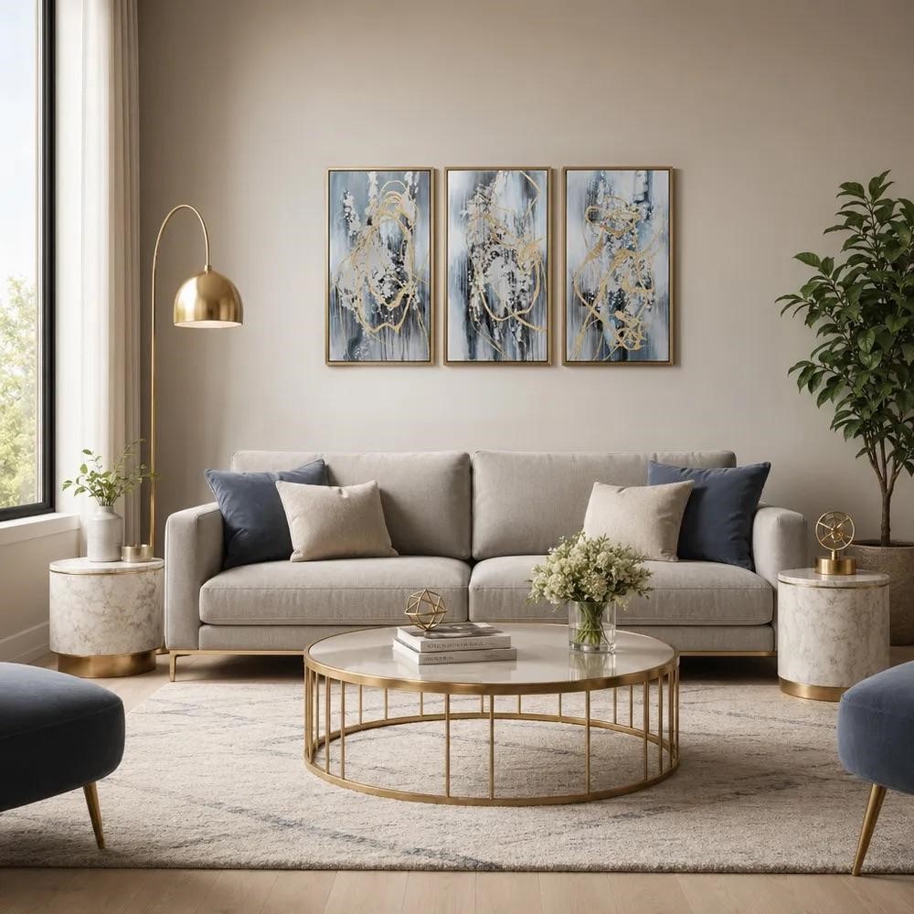
Set of three blue and gold framed art panels hung as a triptych above a beige sofa

Every idea below works better once you know your numbers, and most questions about how to fill a large wall answer themselves the moment you have them. Grab a tape measure, note the wall’s width and height, the width of the furniture against it, and the distance from the floor to the ceiling. Three rules turn those measurements into decisions.

The Two-Thirds Rule for Scale

Your art should span roughly two-thirds the width of the furniture below it.

An 84-inch sofa wants about 56 inches of art. A 60-inch console wants about 40 inches. Go much narrower, and the piece reads as an afterthought, which is why oversized wall art solves these walls faster.

When nothing sits below, size to the wall instead and cover 60% to 75% of its width. That leaves margins your eye needs to read the arrangement as deliberate.

Worth knowing: a group counts as one piece. Five frames hung tightly across 56 inches work exactly like one 56-inch canvas.

Eye Level and the 57-Inch Line

Center your artwork 57 to 60 inches from the floor.

Museums work from a centerline rather than a top edge, and Smithsonian exhibition guidelines set wall labels at a 54-inch centerline as the optimum height for everyone, including seated visitors. Homes sit higher because you are mostly standing.

Tall walls tempt you to break this. You see eight feet of blank space and hang higher to fill it, which straddles the art between the furniture and the people below.

The fix runs upward, not higher. Keep your anchor on the 57-inch line, then add a second row above it.

Map It Out Before You Drill

Holes are permanent. Layouts are not, so settle yours before you commit.

  • Cut paper templates at the exact dimensions of each piece, tape them up, and live with it a day.
  • Outline the full footprint in painter’s tape so you can read the shape from across the room.
  • Lay a gallery wall on the floor beneath the wall, shoot it from above, then rearrange the photo instead of the frames.
  • Find your studs. Framing usually sits 16 or 24 inches on center, and anything heavy belongs on a stud or a rated anchor, never a nail in bare drywall.

12 Ideas for Decorating a Large Wall

These large wall decor ideas run from the simplest and highest-impact to the more involved. Most rooms need only one or two of them, so read for the approach that matches your wall rather than trying to combine everything.

1. One Oversized Statement Piece

The simplest answer is usually the best one. A single large canvas, framed print, or panel does what a dozen small frames cannot: fill the space without asking your eye to assemble anything.

Size it to two-thirds the width of the furniture below, or 60% to 75% of the wall when it hangs alone. Browsing wall art at 60 inches and up shows you fast how different a room reads once the art matches the architecture.

Big walls forgive bold choices far more readily than small ones do, so oversized wall art tends to be the safest expensive decision you can make.

2. A Structured Grid Gallery Wall

Identical frames, identical mats, identical spacing, arranged in a clean rectangle. The grid works because its outer edge forms a single large shape, so nine 16-inch frames function visually as a single 56-inch piece.

Consistency is the whole job here:

  • Keep 2 to 3 inches between frames, and keep it identical throughout.
  • Mark lightly in pencil, then measure again before you drill.
  • Start from the center and work outward, so any rounding error lands at the edges where nobody looks.

A grid forgives nothing. One frame hung a quarter inch off pulls the entire arrangement out of true.

3. A Layered Salon-Style Gallery

The looser cousin of the grid. Mixed frame sizes, mixed finishes, mixed subject matter, all orbiting a central anchor that carries the visual weight. Salon walls feel collected rather than purchased, which suits older homes and rooms with some personality already.

Give yourself one unifying thread so the mix reads as deliberate. A repeated frame color, a consistent mat width, or a shared palette across the art will all do it.

Then lay the whole arrangement on the floor and photograph it before a single hole goes in.

4. An Oversized Mirror

Mirrors earn their place twice over. They cover a serious amount of square footage and push light deeper into the room, which matters most in spaces with one window or a north-facing exposure.

Pay attention to what the mirror actually reflects, because that reflection becomes part of your decor. One facing a window doubles your daylight. One facing a cluttered hallway doubles the clutter.

Oversized mirrors at 72 inches and taller suit stairwells and tall-ceilinged rooms particularly well.

5. A Woven Textile or Tapestry

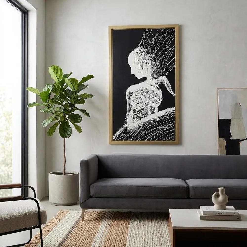
Tall vertical black and gold framed canvas hung at eye level on a large white living room wall

Textiles soften rooms full of hard surfaces, and they quiet them measurably.

A study by Caballol and colleagues in Acoustics tested engineered acoustic textiles and found pleated samples absorbed more sound than flat ones across nearly the entire frequency range, with the best flat sample peaking at 0.87 at 630 Hz.

Those were specialist polyester fabrics, so your linen tapestry will not match those numbers. The pleating finding still transfers, though: a textile hung with folds and body absorbs more than one stretched flat.

Tapestries also cover more wall per dollar than framed art. Hang them from a rod, a dowel through a top sleeve, or a clip rail if you want to swap seasonally.

6. A Triptych or Multi-Panel Set

Art split across two to five panels stretches across a wide wall while still reading as one work.

Horizontal spaces above a sofa or bed suit the format especially well, since a set can span 70 or 80 inches without any single panel becoming unwieldy to hang.

Keep the gaps tight, ideally 2 inches or less, because wide spacing breaks the illusion and turns your unified piece back into separate objects. Hang the panels along a shared centerline and check each with a level as you go, since a triptych exposes drift immediately.
Panel sets also cost less than a single canvas of the same width, making them a practical option for oversized wall art.

7. Floating Shelves as a Display System

Shelves turn a static wall into something you can change whenever the mood strikes. Two or three long shelves stacked with framed art, ceramics, books, and trailing greenery give you depth that flat art cannot.

Vary the heights of what you place there and leave real breathing room between groupings, since a packed shelf reads as storage rather than display.

Mixing wall shelving and storage with a few hung pieces above or beside creates the layered look large walls handle so gracefully.

8. Sculptural and Dimensional Wall Decor

Flat art on a big surface can leave a wall feeling static no matter how large the piece. Metal forms, carved wood panels, and woven discs project outward, catch light on their edges, and cast shadows that move as the sun does.

Dimension does what scale alone cannot: give the wall a reason to look different at 9 a.m. and 6 p.m.

Grouping dimensional wall decor in varying diameters across a wide span covers ground quickly while keeping the arrangement lively.

9. Wall-Mounted Planters and Greenery

Living texture brings a wall to life in a way no printed image manages. Be honest with yourself about the conditions, though.

Illinois Extension houseplant light guidance puts low-light conditions around 75 foot-candles, which you get a few feet from a north window or 15 to 20 feet from a south-facing one, so a wall far from any glass needs plants chosen for that reality.

Practical realities to plan around:

  • Watering access. Anything above shoulder height becomes a chore fast.
  • Drip protection. Use cachepots with saucers or a waterproof backing.
  • Weight. Wet soil is heavy, so mount into studs.
  • Faux alternatives. For high or awkward walls, quality faux greenery is a sensible call rather than a compromise.

10. An Architectural Treatment

Board-and-batten, slat wood, picture molding, or a color-blocked panel treat the wall itself as the decor. Rather than hanging objects on a blank surface, you give the surface texture and rhythm of its own, which often means you need far less on top of it.

The tradeoff is real. This route takes a weekend, some tools, and a conversation with a landlord if you rent. What you get back is the highest impact per dollar on this entire list, since paint and trim cover enormous square footage cheaply and permanently change how the room reads.

Plenty of households are making that same call, with research from the Harvard Joint Center for Housing Studies putting American spending on home improvements and repairs on track to reach $518 billion this year.

11. A Tall Furniture Anchor With Art Above

Large walls often look empty at the bottom, not the top. Nothing grounds them at floor level, so the art above relates to nothing and appears to hover. A bookcase, tall console, credenza, or hutch fixes the underlying problem rather than the symptom.

Once furniture occupies the lower third, your art only needs to relate to that piece instead of the whole wall. The two-thirds rule kicks in immediately, and a much smaller piece suddenly looks correct.

Among all the large wall decor ideas here, this is often the cheapest, since you may already own the furniture.

12. Wall Sconces and Lighting as Decor

Lighting is decor that happens to be useful. Sconces flanking a large piece, a picture light above it, or a pair of oversized fixtures spaced across a wide span all pull the eye horizontally and add warmth after dark.

Check the CRI before you buy. Department of Energy guidance sets 80 or higher as the residential benchmark, and a low-CRI bulb will visibly flatten the colors in whatever art you just spent money on.

Renters have options too, since plug-in sconces and battery picture lights skip the electrician entirely. Pairing accent lighting with art gives you a wall that works in daylight and in lamplight.

Common Mistakes That Make a Large Wall Look Empty

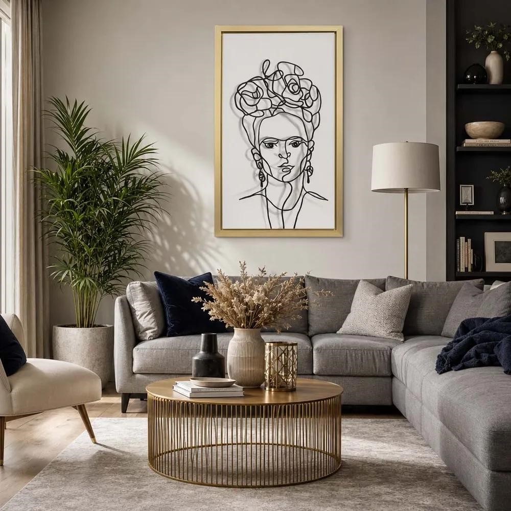
Gold framed line drawing lit by a floor lamp above a gray sectional on a large wall

Most large wall decor ideas fail for predictable reasons. Each of these has a straightforward fix.

  • The art is too small. A 24-inch piece above an 84-inch sofa will always look stranded. Size to two-thirds of the furniture width, or group smaller pieces so they act as one.
  • It hangs too high. Filling vertical space by raising the art disconnects it from the room. Hold the 57-inch centerline and build a second row upward.
  • Frames sit too far apart. Generous gaps dissolve a gallery wall into scattered objects. Tighten to 2 or 3 inches so the group holds its shape.
  • Too many small pieces, no unifying element. Mixed sizes and finishes require a single repeated thread, whether that is frame color, mat width, or palette.
  • The vertical space goes ignored. Tall walls need vertical answers such as stacked rows, a tall mirror, or a floor-to-near-ceiling treatment.
  • The wall gets treated in isolation. Art relates to the furniture below it, not to the drywall. Measure the sofa, not the room.

Work through that list before you buy anything, and you will have solved how to fill a large wall in your particular room, since the fixes cost nothing beyond a little measuring.

How to Decorate a Large Wall on a Budget

Housing now accounts for 33.4% of the average American household’s spending, and Bureau of Labor Statistics data show it was the only major category to rise significantly in 2024, reaching $26,266. So the decorating budget is usually what’s left over.

Here’s how to fill a large wall without a large invoice:

  • Lead with textiles. A tapestry covers more square footage per dollar than almost anything else, and it softens the acoustics, too.
  • Frame cheap prints well. The frame does the perceived-value work, so standard sizes in matching frames read as deliberate.
  • Thrift mirrors and frames. Older frames are heavier and better made, and spray paint unifies a mismatched set in an afternoon.
  • Treat the wall itself. Paint and trim cover an enormous area cheaply, which reduces how much you need to hang.
  • Build gradually. Set the footprint in painter’s tape, hang your anchor now, fill in over months.

That last one matters most. A wall assembled slowly beats one bought in a single afternoon nearly every time.

Which Wall Are You Fixing?

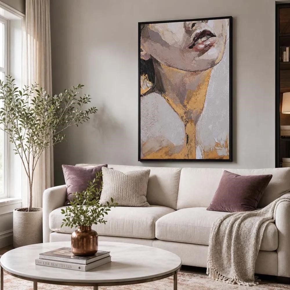
Black framed portrait canvas sized correctly above a cream sofa on a large neutral wall

Go stand in front of it. Nearly every large wall that reads as empty is holding art that’s too small, so start by measuring the furniture underneath and multiplying by two-thirds. That number tells you what to shop for.

Sagebrook Home publishes dimensions on every piece, which makes that math easy. Ask our team what suits your space, or find a showroom if you’d rather handle things first.

FAQs

How do you decorate a large wall?

Scale the decor to two-thirds the width of the furniture below it, then hang it with the center 57 to 60 inches from the floor. How to decorate a large wall is a sizing problem before it’s a shopping problem, so measure the room first and buy second.

How do you fill a large wall without buying more art?

Add dimension rather than quantity. Knowing how to fill a large wall often means textiles, floating shelves, sculptural pieces, or an architectural treatment like board and batten, since these cover more surface per dollar than framed prints and give the wall depth that flat art can’t.

What are the best large wall decor ideas for renters?

Tapestries, leaning oversized mirrors, plug-in sconces, and command-strip gallery walls all work without permanent damage. The strongest large wall decor ideas for renters cover serious square footage from a few anchor points, so you leave three holes behind instead of thirty.

How high should you hang art on a large wall?

Center the piece 57 to 60 inches from the floor, which sits at average standing eye level. On very tall walls, resist raising that line. Add a second row above instead, so the arrangement grows upward while your anchor piece stays connected to the room.

Should wall art be centered on the wall or over the furniture?

Center it over the furniture. Your eye reads the sofa, bed, or console and the art above as one unit, so alignment with the furniture matters more than alignment with the wall. Center on the wall only when the space below stays completely empty.

How many pieces do you need for a gallery wall?

Odd numbers of five, seven, or nine read best, though the count matters less than the outer shape. Measure the footprint you want to cover, arrange pieces to fill roughly that rectangle, and keep 2 to 3 inches between frames so the group holds.

Is it okay to leave part of a large wall empty?

Yes, and you should. Negative space gives an arrangement room to breathe, while covering every inch reads as clutter. Aim to fill roughly two-thirds to three-quarters of the usable surface, leaving margins at the edges so the composition has a visible boundary.

What size art is too small for a large wall?

Anything spanning less than half the width of the furniture below will look undersized. Above an 84-inch sofa, a piece narrower than roughly 42 inches disappears. Oversized wall art at 56 inches or wider fixes it, and a tightly grouped arrangement counts as one piece.

Categories
Uncategorized

What Is Terracotta? Complete Guide to the Material, Color, and Decor

What Is Terracotta? Complete Guide to the Material, Color, and Decor

June 18th 2026

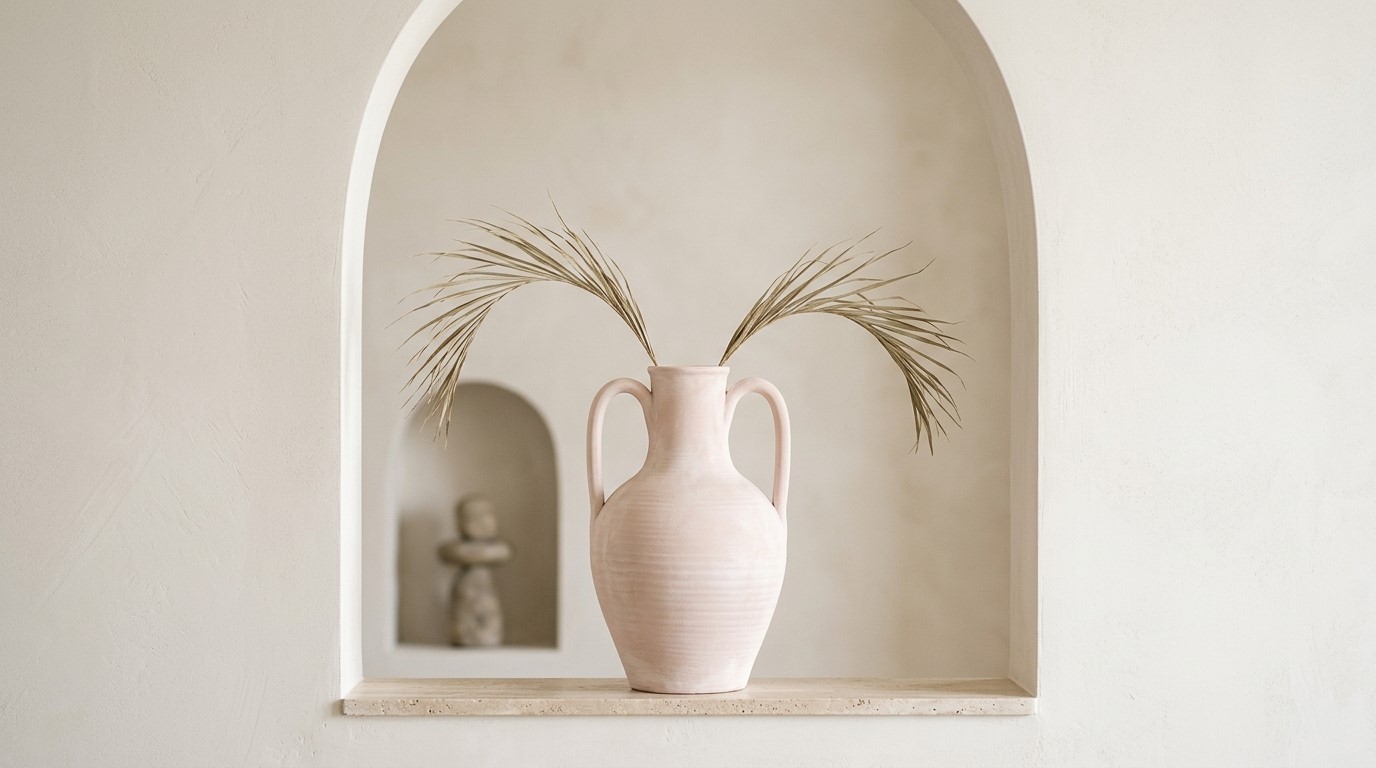
Pale blush terracotta vase with handles set in an arched plaster wall niche

What is terracotta? It’s fired clay, and the orange comes from iron in the earth rather than glaze or paint. The name translates literally from Italian as “baked earth,” which describes the whole process: dig it up, shape it, and fire it until it hardens.

The material is rarely what confuses people. The word is. It names the clay itself, the terracotta color it borrows, and a decor look built on both. This guide separates them, so you know what you’re buying when you browse Sagebrook Home.

Key Takeaways

  • The terracotta meaning traces back to Italian for “baked earth,” and the name is a plain description of the process rather than a style label.
  • What is terracotta made of comes down to one thing: iron-rich terracotta clay, fired at a low temperature, usually between 1,000 and 1,150°C.
  • That low firing leaves it porous. Unglazed pieces breathe, which plants like, but they absorb water and can crack in a freeze.
  • Terracotta vs ceramic is a category question, not a rivalry. Terracotta is a type of ceramic, sitting alongside stoneware and porcelain, which fire hotter and end up denser.
  • The word covers the clay, the objects made from it, and the terracotta color those objects gave their name to.
  • People have been firing it for thousands of years for pottery, sculpture, roof tiles, and flooring, and it remains one of the cheaper ceramic materials to buy.

What Is Terracotta?

Terracotta is iron-rich earthenware clay fired at low temperatures, generally between 1,200°F and 1,830°F.

The terracotta meaning comes straight from Italian for “baked earth.” Because that firing stays low, the clay never fully vitrifies, so it stays porous, and that iron is what turns it orange in the kiln.

Left unglazed, the finished piece can range from pale ochre to deep reddish-brown, depending on the clay bed it came from. Here’s where it gets confusing, though. The same word names the clay, the objects made from it, and the terracotta color those objects inspired.

So when a listing says “terracotta vase,” check the material field rather than the color name.

What Is Terracotta Made Of?

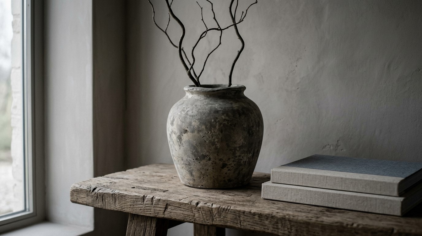
Weathered mottled vessel with bare branches on a rustic oak table

Terracotta clay is mostly natural clay carrying a high proportion of iron oxide, plus sand, quartz, feldspar, and whatever trace minerals sat in the ground where it was dug. During firing, that iron oxidizes and turns red.

No pigment or dye is involved, which is why the color runs through the whole body rather than sitting on the surface.

That through-body color has a practical upside. Chip the rim of a terracotta pot, and you simply expose more of the same red clay, so the damage barely shows.

The Clay Body: Iron-Rich Earthenware

Iron does the visible work here. A study by Gu and Ling in Science Progress measured 6.18% iron oxide in a red clay sample and traced the color to hematite that crystallizes during firing, while quartz and sand hold the shape steady as the body shrinks.

Raw terracotta clay rarely resembles the finished pot, tending toward a pale, washed-out tone rather than the deep red you picture. The color barely develops below 900°C.

Push past that threshold, and the terracotta color deepens fast, going from pale red at 800°C to a dark, saturated red by 1000°C. So a single batch can leave the kiln in more than one shade.

How Terracotta Is Fired

Firing temperature is what separates terracotta from the rest of the ceramics family.

The USC Pacific Asia Museum places earthenware firing at 650°C-1,000°C, stoneware at 1,150°C-1,300°C, and porcelain above 1,300°C.

Those few hundred degrees change everything. At stoneware and porcelain heat, the clay surface actually melts and turns glassy, sealing the body shut. Earthenware never gets there, so the particles fuse just enough to hold shape while a network of microscopic pores survives intact.

That surviving network is why your pot breathes, why it darkens when you water a plant, and why it will not hold water on its own. Potters deliberately close those pores, either by burnishing the surface or by adding glaze and firing a second time.

Is Terracotta Just Clay? Terracotta vs. Ceramic, Stoneware, and Porcelain

Terracotta is a type of ceramic, not a rival category. Any object made from clay and hardened by heat qualifies as ceramic, so a terracotta vs ceramic comparison is really a question of which ceramic you happen to be holding.

Terracotta sits at the low-fired, porous end of that family, and peer-reviewed research in Scientific Reports on 10,000-year-old ceramic beads from northern China places their firing around 500°C to 600°C, which shows you how far down the temperature scale that end of the family reaches.

MaterialFiring tempPorosityDurabilityTypical use
Terracotta650°C to 1,000°CHigh, absorbs waterModerate, chips at edgesPlanters, vases, tile, sculpture
Stoneware1,150°C to 1,300°CLowStrong, chip-resistantDinnerware, crocks, mugs
PorcelainAbove 1,300°CNear zeroVery strong, brittleFine tableware, sinks, tile
Glazed ceramicVaries by clay bodySealed surface onlyDepends on body beneathDecor, dinnerware, wall tile

Glaze is the trap. It coats the surface without changing the body beneath, so a glazed terracotta planter still soaks up water wherever the glaze stops, and can crack in a freeze.

So judge a piece by what it must survive, not the label. Terracotta wins on warmth and price, stoneware and porcelain on strength and water resistance, which is why your ceramic home decor accents work best mixed.

What Is the Terracotta Color?

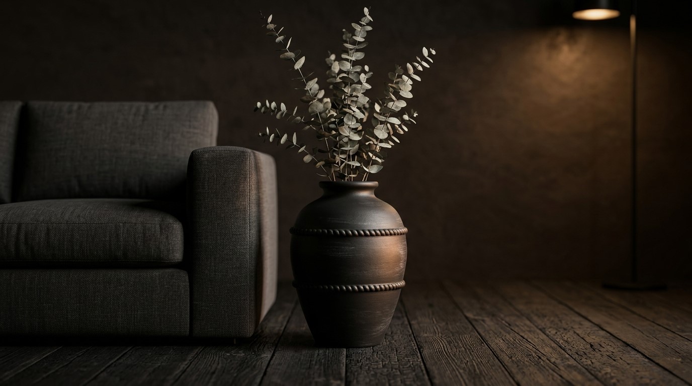
Dark fired terracotta urn with eucalyptus stems beside a charcoal sofa

The terracotta color is a warm reddish-orange with brown undertones, named after the fired clay it describes.

Real terracotta spans a wide range, from pale peachy blush through burnt sienna to a deep brick red, and the exact shade depends on iron content, firing temperature, and how long the piece sat in the kiln.

That range is worth keeping in mind, since a swatch labeled terracotta on one site can look noticeably cooler or dustier than a pot you already own. Designers tend to treat terracotta as a warm neutral rather than an accent, which is why it shows up so consistently in seasonal forecasts.

The American Coatings Association’s 2026 color roundup records Sherwin-Williams building “reddish terracotta” into its collection of the year alongside stucco shades and burgundy, with other manufacturers naming clay, wood, and stone as their reference points for 2026.

Terracotta Color Palette Pairings

Terracotta plays well with almost everything, though a handful of pairings do the heavy lifting in real rooms. If you are building a scheme around warm-toned pieces, these five are reliable.

  • Cream and off-white. The softest option and the easiest to live with. Cream walls let a terracotta vase read as warmth rather than as a statement, which suits bedrooms and dining rooms where you want calm.
  • Sage and olive green. Green sits opposite orange on the color wheel, so the contrast is built in. Muted greens keep the pairing grounded instead of tipping into holiday territory.
  • Warm woods. Oak, walnut, and rattan share terracotta’s undertone, giving you a layered, tonal look. Vary the texture heavily here, since matching warmth without contrast can flatten a space.
  • Black metal accents. A slim iron frame or matte black hardware sharpens the whole palette. You need very little of it for the effect to land.
  • Deep teal. The most daring pairing on the list and the most rewarding. Teal cools the room down while amplifying the terracotta color through sheer contrast.

Grouping warm-toned decorative accents in threes across a console or shelf gives these palettes somewhere to live without committing you to repainting anything.

A Short History of Terracotta

Fired clay predates farming, writing, and cities. The Venus of Dolní Věstonice, a ceramic figure from what is now the Czech Republic, dates back roughly 29,000 years.

As reported by Smithsonian Magazine, archaeologists at the tomb of Qin Shi Huang unearthed a rare high-ranking commander, only the tenth found among the roughly 2,000 warriors excavated since 1974, out of an estimated 8,000 buried there.

Terracotta then ran through Greek workshops, Renaissance studios where clay caught gesture faster than marble, and nineteenth-century facades, where it clad buildings more cheaply than stone. Through all of it, the terracotta meaning never moved, so the pot on your shelf shares its process with an emperor’s army.

Common Uses of Terracotta in the Home

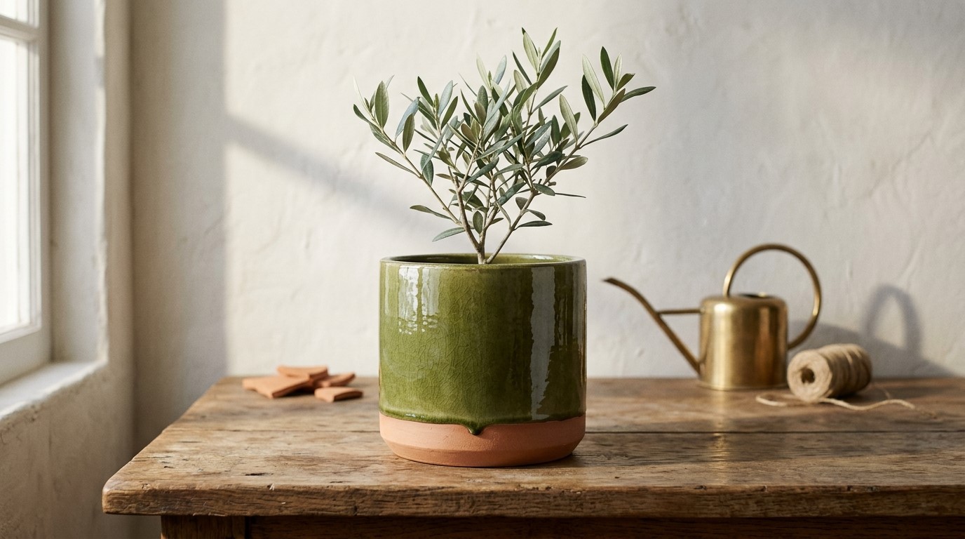
Green glazed planter with the raw terracotta clay body left exposed around the base

Terracotta shows up in your home as planters, decorative vessels, and tile or flooring. Each one leans on a different property: porosity, color, or texture. That pot on your shelf is cheap, warm, and it flatters nearly every palette you own.

What you now know about what terracotta is made of tells you which form to buy for which job.

So use porosity where plants need it, color where a room feels cold, and unglazed clay wherever you want something that looks right beside linen and wood.

Terracotta Pots and Planters

Porosity is the point here. Because unglazed walls let moisture evaporate outward, clay pulls water away from the roots.

Virginia Cooperative Extension puts it plainly, noting terracotta pots “will tend to dry out the rootzone more quickly” no matter which potting mix you use, and recommends them for arid plants like cacti and succulents.

So match the pot to the plant:

  • Cacti, succulents, snake plants: terracotta works in your favor.
  • Ferns, calatheas, tropicals: expect to water noticeably more often.
  • Anything you forget about: clay forgives you less than plastic.

One question decides it. Does this plant want to dry out, or stay evenly moist? Planters sized for your plants follow.

Terracotta Vases and Decorative Objects

Unglazed clay does something glass and metal cannot. Its matte, slightly chalky surface absorbs light instead of bouncing it back, so a terracotta vessel reads as quiet even when it is large.

Three rules make a shelf work:

  • Group in odd numbers, since threes read as composed and fours read as a row.
  • Vary height by at least a third between neighbors.
  • Pair one rough unglazed piece with one high-gloss glazed piece in a similar tone.

That last one does the most work. Contrast in finish makes both objects look chosen rather than collected, which you can see when fast-browsing our full range.

Terracotta Tile, Roofing, and Architectural Uses

Terracotta goes structural at scale.

Saltillo tile from Mexico and Spanish clay pavers put it underfoot across warm climates, where the tonal variation between fired tiles is the selling point rather than a defect.

Curved barrel roof tiles shed rain and reflect heat, and plenty are still working after a century outdoors.

That sculptural quality scales down too. Architectural terracotta covers cornices, window surrounds, and entire facades, and the same visual language appears indoors in clay reliefs and sculptural wall decor sized for a real living room.

Is Terracotta Expensive?

No. Terracotta is among the cheapest ceramics because the clay is common, and low-firing requires far less energy than stoneware or porcelain.

Plain unglazed pots run from a few dollars to modest double digits, while glazed, hand-thrown, and sculptural pieces climb well past that.

Three things move your price:

  • Size: Bigger pieces consume more clay and pose greater kiln risk.
  • Glazing: A second firing costs a second round of energy.
  • Hands or mold: Handmade pieces show tool marks, and you pay for them.

How to Care for Terracotta

Nearly every care rule for terracotta traces back to one fact: the clay drinks whatever touches it. That is worth knowing before you clean, store, or fill a piece.

  1. Wash with warm water and a stiff brush. Skip detergents, because porous clay absorbs them and releases them slowly into your soil or whatever the vessel holds.
  2. Keep it out of the dishwasher. Heat and pressurized water drive moisture deep into the body, and trapped moisture cracks it. Hand wash, then air dry fully.
  3. Seal it only when it must hold water. A food-safe or masonry sealer makes a vessel watertight for cut flowers. Sealing kills breathability, though, so leave plant pots bare.
  4. Read white crust as a signal, not a stain. That chalky efflorescence is mineral and fertilizer salt carried out through the wall as water evaporates. Scrub it dry, soak in diluted vinegar, rinse well.
  5. Never let an outdoor pot freeze wet. Water absorbed expands into ice, splitting the wall from the inside. Empty, dry, and store yours before a hard freeze, or buy frost-resistant clay fired hotter.

So Which Terracotta Do You Actually Need?

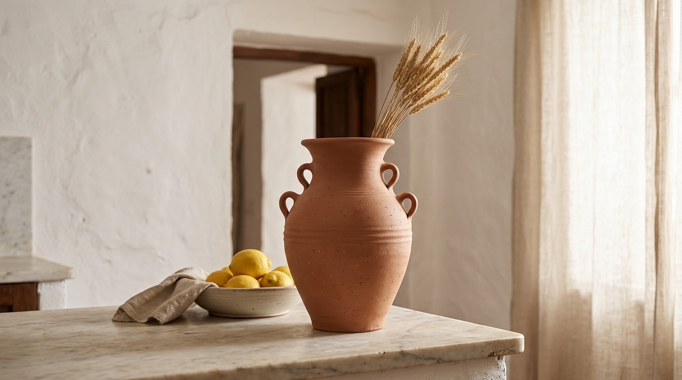
Unglazed terracotta vase with handles holding dried wheat on a marble kitchen counter

Check the material field, not the color name.

That single habit is the payoff of everything above, because what is terracotta splits three ways: the fired clay, the objects made from it, and the color that took the name. A vase called terracotta might be neither of the first two.

Sagebrook Home lists the material on every piece, so you can tell. Ask our team what fits your space, or find a showroom and feel the difference yourself.

FAQs

What is terracotta?

Terracotta is fired earthenware clay, baked at low temperatures between roughly 650°C and 1,000°C. The name is Italian for baked earth. Because it fires cool, the clay never vitrifies, which leaves it porous, unglazed, and warm orange from the iron oxide running through the body.

What is terracotta made of?

Terracotta is made of natural clay high in iron oxide, mixed with sand, quartz, feldspar, and trace minerals from the ground it came from. No pigment is added because firing oxidizes the iron to hematite. That is why the color runs right through the piece.

What does terracotta mean?

The terracotta meaning comes straight from Italian for baked earth, which describes the process rather than a style. Today the word does three jobs at once: it names the clay, the objects fired from it, and the reddish-orange color those objects gave their name to.

What is the difference between terracotta vs ceramic?

Terracotta is a type of ceramic, not a rival to it. Terracotta vs ceramic is a temperature question: terracotta fires at 650°C to 1,000°C and stays porous, while stoneware hits 1,150°C to 1,300°C and porcelain goes higher, melting the surface glassy and watertight.

Is terracotta waterproof?

No. Unglazed terracotta is porous by design, so water passes slowly through the clay and evaporates off the surface. A food-safe or masonry sealer makes terracotta clay sufficiently watertight for vases and fountains, though it also reduces the breathability your plants rely on.

Can terracotta be left outside in winter?

Not safely. Standard pots crack in freezing weather because absorbed water expands as it turns to ice, splitting the pot from the inside. Empty, dry, and store them under cover before the season turns. Frost-resistant clay fired hotter handles cold better, but nothing unglazed is immune.

Why does terracotta turn white?

That chalky film is efflorescence, a crust of mineral and fertilizer salts carried through the porous wall by water and left behind as it evaporates. It signals hard water or heavy feeding rather than damage. A stiff brush and a vinegar soak clear it.

Is terracotta the same as red clay?

Not quite. Red clay is the raw material dug from the ground, while terracotta is what that clay becomes after firing. Most terracotta starts as red or brown earthenware, though raw clay usually looks pale and washed out until the kiln deepens it.

Does terracotta go out of style?

Rarely, because the terracotta color falls within the warm neutral range, which anchors rooms rather than dating them. Paint forecasts keep cycling earthy reds back into rotation, and unglazed clay reads as texture more than trend, which gives it unusual staying power in any palette.

Categories
Uncategorized

The 10 Best Garden Statues to Buy in 2026

The 10 Best Garden Statues to Buy in 2026

June 1st 2026

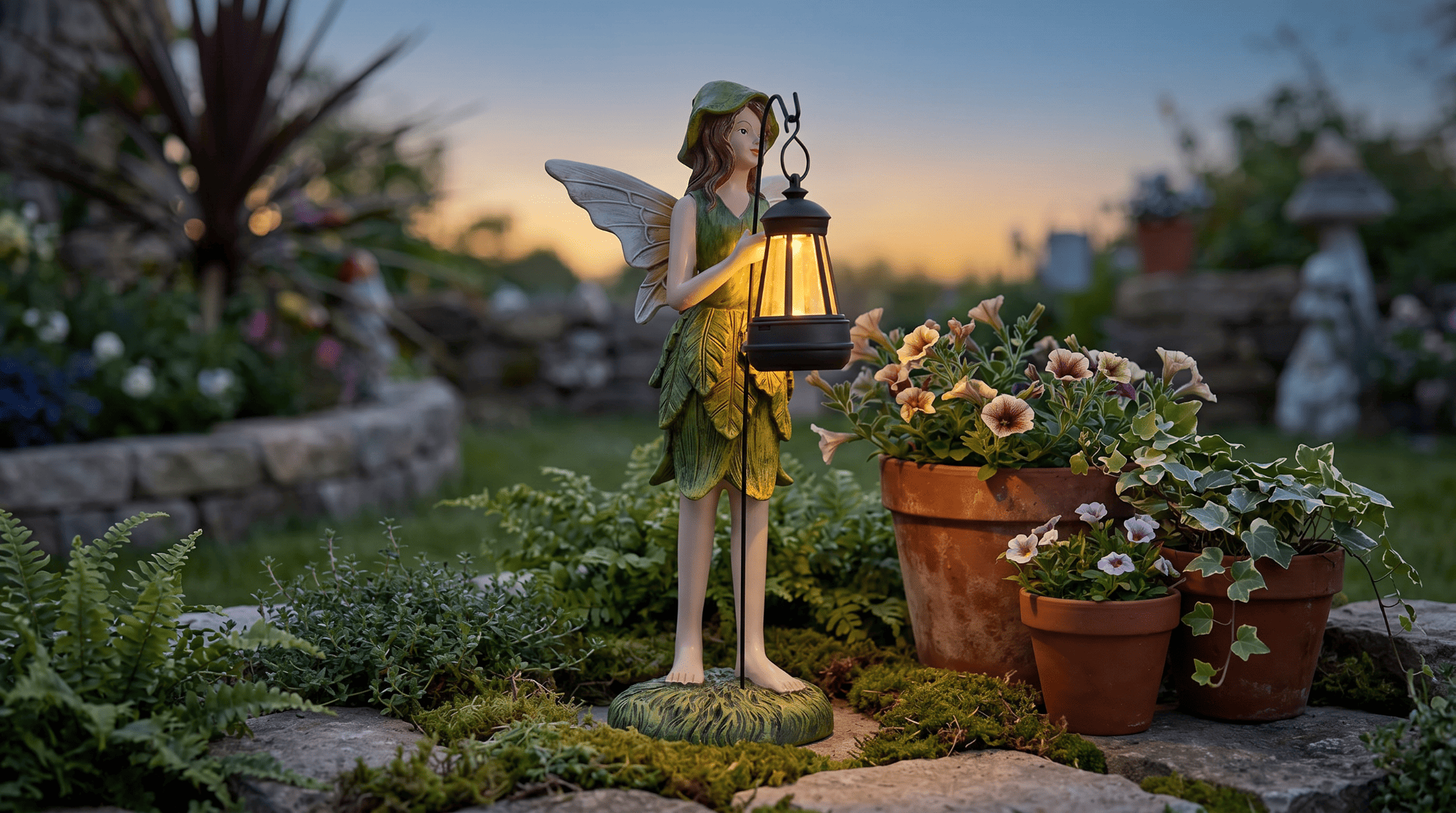
Valfield green fairy garden statue holding a glowing solar lamp in a cottage fairy garden at dusk

Some gardens you forget. The ones you don’t usually have a statue in them.

That is no accident. The right garden statues give the eye somewhere to land, turn a flat lawn into a scene, and hint at who lives there. You don’t need a redesign or a weekend crew, just one piece with real presence, set where it can work.

Which brings us to 2026. At Sagebrook Home, we design trend-driven garden statues in a range of materials and scales for courtyards, patios, and boutique gardens alike. Below are the 10 we’d buy, along with how to place and style them.

Key Takeaways

  • Garden statues create focal points, anchor outdoor décor, and boost a property’s curb appeal.
  • Material drives maintenance: resin handles year-round weather, while ceramic suits mild climates or covered spots.
  • Scale matters more than price; the wrong size undercuts even a beautiful piece.
  • Whimsical characters and nature-inspired forms lead the 2026 garden statue trends.
  • Sagebrook Home offers trend-forward garden statues from 5-inch accents to 32-inch statements, a deeper range than most “garden statues near me” searches surface.

Why Garden Statues Are Trending in 2026

The outdoor-living boom that began in 2020 never faded; it raised the bar.

Once your backyard works like a second living room, it wants the same finishing touches, and that is where garden statues step in.

The shift in 2026 is intention. You are choosing collected, sculptural pieces over generic yard filler, with whimsical characters and nature-inspired forms leading the way. Better materials help, since weather-resistant garden statues now survive real seasons instead of fading after one.

There is also a resale payoff. The National Association of Realtors found in its 2023 outdoor report that 92% of agents advise improving curb appeal first, and well-placed statuary does that fast. Designers spot these forms early in home décor trade publications.

How We Selected the 10 Best Garden Statues

We did not rank these garden statues by popularity. Each earned its spot against criteria that hold up in your yard, not a showroom.

  • Year-round durability (all resin unless noted).
  • Visual impact aligned with 2026 design.
  • Size range, from compact accents to tall statements.
  • Craftsmanship and finish quality up close.
  • Versatility across whimsical, traditional, and minimalist gardens.

Durability mattered most. In its 2025 report, the International Casual Furnishings Association found that 67% of buyers prioritize practicality and durability over style, so we led with resin. Every piece ships from our garden décor collection, so what you see is shoppable.

The 10 Best Garden Statues to Buy in 2026

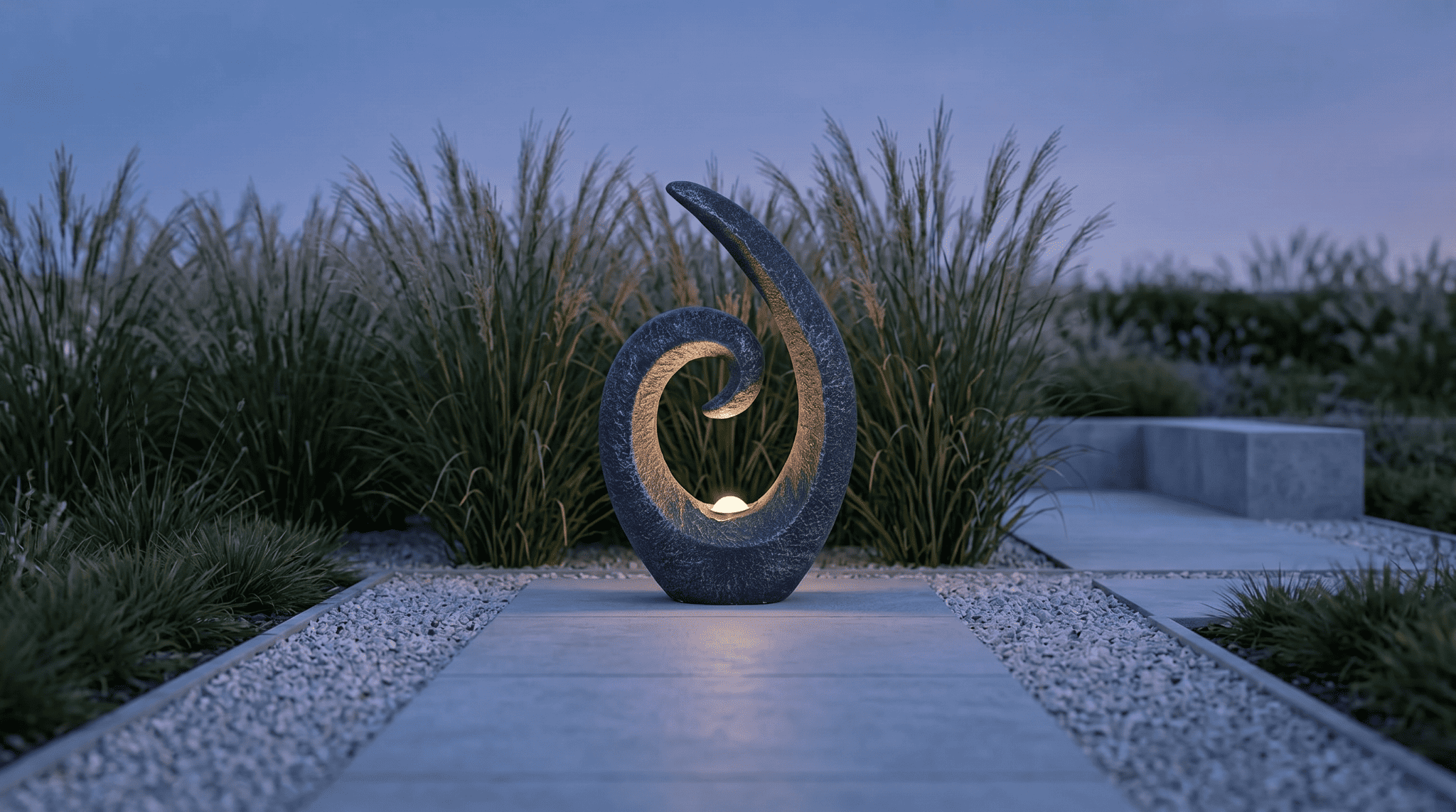
Stoneford gray loopy solar garden statue at the end of a modern minimalist gravel path

Here is the lineup, ordered so you can match a piece to your space and style.

1. Chathamholm Gray Angel Cherubs Garden Statue | SKU 23765 | 19″H

A pair of cherubs, cast in soft gray resin and posed together on a rocky base, reads timeless without tipping into fussy.

At 19 inches, it has the presence to anchor a formal bed, and ordering two lets you flank an entryway with matching symmetry. As a newer arrival, it slots in easily beside more classic pieces.

  • Gray resin angel-cherub pair on a rock base, 11″L x 10″W x 19″H, lightweight and weatherproof.
  • Classic, traditional silhouette with broad, multi-generational appeal.
  • Ideal for formal beds, flanking entryways, and symmetrical layouts.
  • Pairs naturally with stone pathways, clipped hedgerows, or a quiet water feature.

2. Valburn Brown Mushroom Garden Statue | SKU 22145 | 32″H

The tallest piece in the collection, this oversized wood-grain mushroom is a statement you can read from the porch. At 32 inches, it works as a primary anchor on a wide lawn or in a woodland bed, and it is on sale right now, which makes the scale even easier to justify.

  • Oversized wood-grain mushroom in brown resin, 17″L x 17″ W x 32″H.
  • Currently on sale, and the tallest statue we carry.
  • Built for large lawns, woodland gardens, and cottage landscapes.
  • Delivers strong vertical impact as a standalone focal point.

3. Stoneford Gray Loopy Statue with Solar | SKU 20149 | 20″ H

For modern gardens, this abstract, loopy form is the most design-forward piece in the range, and its integrated solar feature gives it a second life after dark. The slim 6-inch footprint slips into tight corners, so it earns a spot where bulkier pieces won’t fit. It is on sale now, too.

  • Abstract loopy form in dark gray resin with integrated solar, 12″L x 6″W x 20″H.
  • On sale, one of the most sculptural pieces we offer.
  • Built for modern and minimalist gardens, with built-in nighttime glow.
  • Slim vertical silhouette suits narrow patio corners and path ends.

4. Valfield Green Fairy Holding Solar Lamp | SKU 23779 | 12″H

Charm with a function. This little fairy cradles a solar lamp, so it earns its keep as soft lighting once the sun drops. At 12 inches on a 5-inch base, it tucks into containers and small beds without crowding them, and it is a recent addition worth a look.

  • Whimsical fairy with solar lamp in a green and multi finish, 5″L x 5″ W x 12″H.
  • Built-in solar lighting adds purpose to the personality.
  • Great for cottage gardens, children’s spaces, and fairy-garden displays.
  • Compact enough for small patios and container groupings.

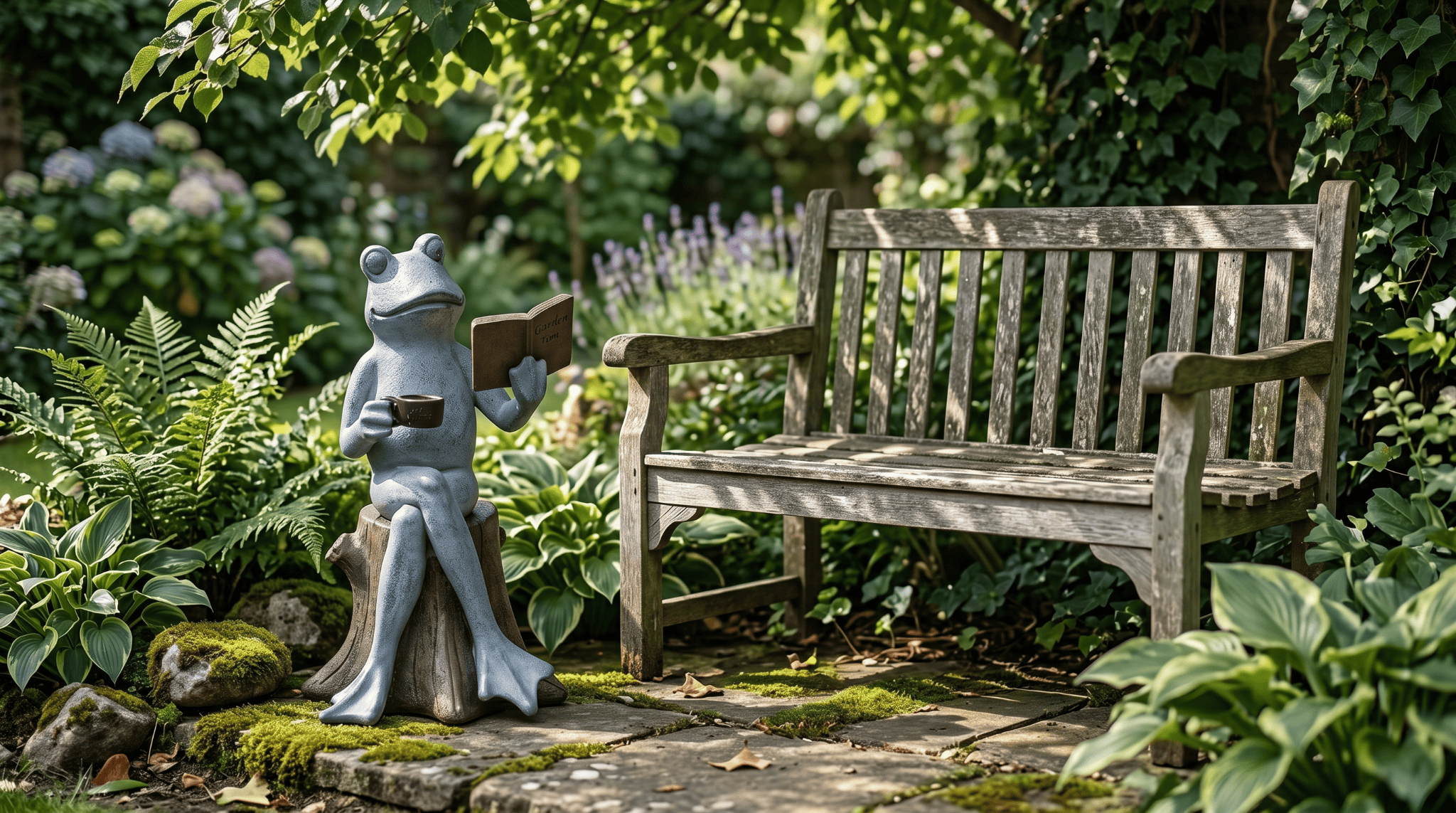
5. Harlemwood Gray Frog on Stump with Book & Coffee | SKU 21235 | 13″H

A bestseller for good reason. This frog, perched on a stump with a book and a coffee, gives any corner a small story to tell. The detailed resin holds up outdoors, and at 13 inches, it settles beside seating or into a shaded nook without taking over the scene.

  • Frog on a tree stump holding a book and coffee, gray and multi finish, 8″L x 8″ W x 13″H.
  • One of our best-selling garden pieces, full of instant personality.
  • Lovely in cottage gardens, shaded reading nooks, or beside a bench.
  • Finely detailed resin construction built to weather the seasons.

6. Kiraside Green Family of Bunnies Garden Statue | SKU 23782 | 11″H

A new arrival with quiet warmth, this bunny family settles into a planted bed as it grows there.

The green-and-gold finish reads natural rather than novelty, and the small 11-inch footprint suits patios, raised planters, and layered spring displays.

  • Family of bunnies in a green and gold finish, 7″L x 6″W x 11″H.
  • Warm, nature-inspired design that blends into greenery.
  • Excellent for spring displays, family-friendly yards, and layered beds.
  • Small footprint suits patios and raised planters.

7. Bondland Bronze Feet-in-the-Air Hippo | SKU 22148 | 17″H 

Unexpected and a little funny, this upside-down hippo becomes a focal point in open spaces where it has room to surprise. The bronze resin finish keeps the humor looking intentional rather than kitschy, and at 17 inches, it holds a medium yard or an open bed on its own.

  • Playful feet-in-the-air hippo in a bronze resin finish, 12″L x 8″ W x 17″H.
  • Bold silhouette that anchors flat or open garden areas.
  • Bronze finish suits tropical, eclectic, and contemporary landscapes.
  • Mid-scale size works in medium yards paired with low shrubs.

8. Finchrun Gray Frogs Piggyback Ride with Solar Eyes | SKU 20292 | 14″H

Another bestseller, this stacked frog duo glows in the eyes after dark thanks to its solar feature.

At 14 inches, it anchors a bed without crowding a compact space, and the charm carries just as well around a pond or in a shaded corner.

  • Stacked frogs on a piggyback ride with solar-lit eyes, gray resin, 11″L x 9″W x 14″H
  • A best seller; solar eyes add gentle ambiance at night
  • Durable and charming, suited to family gardens, pond surrounds, and shaded beds
  • Mid-scale height anchors a bed without overwhelming a small yard.

9. Carsonley White Garden Cherub with Heart | SKU 20296 | 11″H

A fresh take on a classic. This cherub holds a heart in a white-and-gold colorway that feels current rather than dated. Low and wide at 15 inches across, it centers a bed or flanks an entrance with ease, and it is on sale right now.

  • Cherub holding a heart in a white and gold finish, 15″L x 8″ W x 11″H.
  • Currently on sale, traditional styling in an updated palette.
  • Pairs with roses, topiary, and formal garden arrangements.
  • Low, wide stance centers a bed or flanks an entrance.

10. Hattongate Blue Reactive Finish Bird | SKU 20232-03 | 5″H

The only ceramic piece here is the most one-of-a-kind. Its reactive blue glaze fires a little differently on every bird, so no two match exactly. Because it is ceramic rather than resin, keep it in a covered spot or a mild climate, then let it accent a ledge or potted grouping.

  • Ceramic bird in a reactive blue glaze, 10″L x 5″ W x 5″H
  • Distinctive reactive-glaze finish, unique to each piece
  • Best suited to mild climates or covered areas, since ceramic needs more shelter than resin
  • Ideal as an accent on ledges, garden walls, or potted groupings

How to Choose the Right Garden Statues for Your Space

Harlemwood gray frog garden statue reading a book with coffee beside a bench in a shaded cottage garden

Picking well comes down to a few decisions you can make in minutes. If you have been typing “garden statues near me” into a search bar and feeling buried in options, let these filters do the narrowing for you.

Get the Scale Right

Match your garden statue to its surroundings. A wide lawn carries an oversized piece like the 32-inch Valburn Mushroom, while a small patio suits a 12-inch Valfield Fairy.

When a piece fights the space, both lose.

Choose the Right Material

Resin does the heavy lifting in our range. It stays light enough to move on a whim, shrugs off rain and frost, and resists the fading, cracking, and warping that age cheaper materials fast.

Ceramic, like the Hattongate Blue Bird, brings more artistry, but it can chip in freeze-thaw cycles, so keep it covered or save it for mild climates. That toughness matters because your yard now serves as an extra room.

According to Florida Realtors, outdoor spaces are increasingly treated as true extensions of the home, so the pieces you place there should hold up like indoor furnishings, not seasonal décor.

Think About Placement

A few placements rarely miss:

  • An entryway focal point that greets guests.
  • A piece centered in a garden bed.
  • Statuary near a water feature, for movement and reflection.
  • A figure framed by hedges or tall grasses.

Then place each statue as a single note in a larger composition, like layering home decor accents indoors.

Match Your Garden Style

Finally, let style guide your pick:

  • Modern or minimalist: Stoneford Gray Loopy Statue
  • Traditional or classical: Chathamholm Angel Cherubs, Carsonley Cherub with Heart
  • Whimsical or cottage: Harlemwood Frog on Stump, Valfield Solar Fairy, Kiraside Bunnies
  • Tropical or eclectic: Bondland Bronze Hippo
  • Nature or botanical: Valburn Mushroom

Garden Statue Placement Rules Designers Follow

Hattongate blue reactive-glaze ceramic bird garden statue on a patio table beside a succulent and lantern

Designers follow a handful of rules that make any piece look deliberate, and you can borrow every one:

  • Place focal points near eye level, where they draw the strongest engagement.
  • Use the rule of thirds when positioning within a flower bed.
  • Leave negative space around the statue so it can breathe.
  • Keep pathways clear so the piece never blocks foot traffic.
  • Let solar-integrated designs highlight texture after dark.

Solar-integrated statues like the Stoneford Loopy and the Finchrun Frogs earn their place for practical reasons.

According to the U.S. Department of Energy, they install easily and stay virtually maintenance-free. Winter can still cut run times by 30% to 50%, and shade or a dirty panel drags performance further, so set yours where it catches real sun.

Common Garden Statue Mistakes to Avoid

A few missteps quietly undo good intentions, so keep these off your list:

  • Choosing a piece too small for the yard (the 5-inch Hattongate Bird is an accent, not a focal point).
  • Placing a statue with nothing behind it to anchor the view.
  • Ignoring climate durability, since ceramic needs more shelter than resin.
  • Crowding a space with too many whimsical focal points at once.
  • Leaving lightweight resin unsecured in high-wind regions.

Best Garden Statues by Yard Size

Scale is the first decision for any garden statue, so match each piece to your space.

Small Gardens & Patios

In tight spaces, stay under about 15 inches so the piece reads as a detail, not a disruption.

The Kiraside Bunnies (11″H) and Valfield Solar Fairy (12″H) shine here. Cluster compact pieces near where you sit, and raise one onto a side table or plant stand to give it presence without eating floor space.

That way, the sculpture and the chairs you choose read as one composed vignette rather than an afterthought.

Medium-Sized Yards

Here you have room for a mid-scale focal piece, between 14 and 20 inches, that holds its own.

The Finchrun Frogs (14″H), Bondland Hippo (17″H), and Stoneford Loopy (20″H) all work as end-of-path anchors or paired with layered shrubs. One confident piece beats a scatter of small ones, so place it where the eye naturally lands.

Large Landscapes

Open lawns swallow small statues, so go big and let symmetry organize the space. The Valburn Mushroom (32″H) and Chathamholm Angel Cherubs (19″H) carve zones out of wide areas and suit estate-style design.

Give a tall piece a backdrop, like a hedge or wall, so it reads as intentional rather than stranded.

Commercial & Hospitality Spaces

In hotels, restaurants, and shops, you need statues that are tough, easy to care for, and great in photos. Stylish resin pieces like the Bondland Hippo, Stoneford Loopy, and Valburn Mushroom do all three.

They stand up to constant foot traffic and weather while still looking good on camera, making them a good fit for boutique hotel gardens, restaurant patios, and retail displays.

Why Choose Sagebrook Home for Garden Statues

We design garden statues for how people live outside today.

  • Trend-driven designs for modern outdoor living
  • Styles from classical cherubs to abstract, loopy forms
  • Characters and statement pieces, 5 to 32 inches
  • Solar-integrated options for nighttime glow, like the Stoneford and Finchrun
  • Reliable fulfillment for retailers, designers, and hospitality buyers

Demand is climbing. According to Research Nester, the garden décor market should reach roughly $7.3 billion in 2026 and $11.3 billion by 2035, with solar pieces growing fastest. So whether you sell or design, we make it easy to order at wholesale and restock your bestsellers.

Ready to Elevate Your Outdoor Space?

Carsonley white and gold cherub garden statue holding a heart beside terracotta pots in a flower bed

The right garden statues turn an ordinary yard into something curated, a space that feels designed, not just decorated. So lead with scale, respect your climate, and give each piece its own space to breathe.

In 2026, outdoor design rewards a confident statement, and one well-chosen piece is often all it takes.

When you’re ready, see the trend-forward Sagebrook Home statuary collection in person at a showroom or upcoming event, or talk with our team about the perfect piece for your space.

FAQs

What materials are best for garden statues in different climates?

In harsh, freeze-thaw climates, the toughest garden statues are concrete, stone, or treated metal, which resist cracking and rust. Resin suits mild to moderate regions, since it stays lightweight and weather-resistant. Matching material to your climate keeps a piece looking new for years.

How large should garden statues be for a small yard?

For a small yard or patio, garden statues under about 24 inches work best, and many designers stay under 15. Slim, vertical pieces avoid clutter while giving you a clear focal point. If you search for garden statues near me, filter by height first.

Do garden statues increase home value?

Garden statues rarely change an appraisal on their own, but they boost curb appeal, which shapes the value buyers perceive. A well-placed piece signals a thoughtfully designed yard, reading as care and quality, and strengthens the first impression that helps sell a home.

Where should I place a garden statue for maximum impact?

Place a garden statue at the end of a pathway, centered in a garden bed, or framed by hedges, so the eye travels straight to it. Leave negative space around it, add lighting or a solar feature for nighttime, and avoid blocking foot traffic.

Are modern or traditional garden statues more popular in 2026?

Both stay popular in 2026. Modern landscapes favor minimalist, sculptural garden statues like abstract, loopy forms, while traditional gardens still choose cherubs and classical figures. The best pick follows your existing style, so let your architecture and planting guide the choice, not the trend.

Categories
Uncategorized

How to Measure Your Room Before Buying Furniture (Avoid Common Layout Mistakes)

How to Measure Your Room Before Buying Furniture (Avoid Common Layout Mistakes)

June 1st 2026

Well-scaled living room with sofa, accent chair, and coffee table showing balanced furniture layout

The most expensive furniture mistake is measured in inches, not dollars. One miscalculated wall, and that perfect sectional becomes a return slip, a sore back, and a weekend you’ll never get back.

Knowing how to measure a room for furniture protects your budget and your sanity. It also unlocks something trickier to nail: a small living room furniture layout that actually breathes and flows naturally.

Most shoppers eyeball proportions and hope for the best. That’s exactly where it goes sideways.

At Sagebrook Home, we’ve helped designers sidestep those costly missteps, so this guide hands you the same pro process.

Key Takeaways

  • Accurate room measurements prevent costly returns, blocked walkways, and furniture that looks out of scale.
  • Learning how to measure a room for furniture layout means tracking length, width, height, doorways, and architectural features in one process.
  • Standard furniture clearances: 30 to 36 inches for walkways, 14 to 18 inches between sofa and coffee table, and 36 inches around dining tables.
  • A scaled floor plan, even a rough sketch, prevents common furniture layout mistakes before you spend a dollar.
  • Whether you’re designing a small living room furniture layout or a large open concept, accurate room dimensions are the foundation of good interior design.

Why Measuring Your Room Matters Before Buying Furniture

Home office layout with wooden desk and accent chair with proper clearance

Your space shapes how you feel every single day.

In fact, a Personality and Social Psychology Bulletin study ties cluttered, unfinished homes to flatter daily cortisol patterns, a stress profile linked to poorer long-term health. Cramped, badly proportioned rooms quietly chip away at your well-being.

Beyond comfort, skipping measurement costs you too. A sofa wedged in your doorway means restocking fees, return shipping, and weeks of waiting. Meanwhile, NAHB home buyer research data shows the median new home shrunk to 2,150 square feet in 2024, the smallest in 15 years. Every inch counts more now.

That’s exactly why measuring a room for furniture is your first move, whether you’re styling a small living room or planning a larger open concept. Accurate dimensions protect both your investment and your daily comfort.

Tools You Need Before You Start Measuring

You don’t need a contractor’s kit. A few simple tools handle most of the work.

  • A 25-foot tape measure with a locking mechanism for solo use.
  • A laser distance measurer for tall ceilings and long walls.
  • Graph paper or a floor plan app for sketching as you go.
  • Painters’ tape to mark furniture footprints before buying.
  • A second person if your room is 12 feet by 12 feet or larger.

Even better, painter’s tape is a designer’s secret weapon. Outline a sofa’s footprint, and you’ll instantly see if traffic flow works.

How to Measure Your Room Step by Step

Once your tools are ready, you’ll follow the same order the pros use. Working through each step the same way every time keeps you from missing a measurement you’ll wish you had later.

Step 1: Capture Length, Width, and Height

Start with the longest wall, then work through each dimension in order:

  • Length and width: Run your tape measure from baseboard to baseboard along the longest wall, then repeat for the width.
  • Wall variance: Take each measurement twice, once at floor level and again at waist height, since older walls often bow or lean.
  • Ceiling height: Record it in at least two corners.

That last one matters most. Vaulted, sloped, and tray ceilings change what fits, especially for tall bookcases, pendants, or oversized art.

Step 2: Note Every Architectural Feature

With your basic dimensions down, you’ll need to map what’s actually on those walls. They’re rarely a clean rectangle.

Mark each of these on your sketch, including the distance from each feature to the nearest corner:

  • Windows and doors.
  • Fireplaces and mantels.
  • Radiators and vents.
  • Columns, beams, and built-ins.

Here’s why every inch matters: a 90-inch sofa fits beautifully on a 96-inch wall, until you discover the radiator eats six inches at one end. Catching those obstructions now saves you from the worst furniture layout mistakes later.

Step 3: Measure Doorways, Hallways, and Stairs

After mapping your room, you’ll need to plan the route in. This is where most furniture-delivery disasters happen.

Measure the width and height of every entry your new piece must pass through. Beyond the doorway itself, don’t forget elevator depth, stairwell turns, and the diagonal clearance of your front door.

For context, the U.S. Access Board sets 32 inches as the minimum doorway clearance, though tight modern builds often come in narrower. Verifying every passage now spares you a costly return later.

Step 4: Map Outlets, Vents, and Light Switches

With the room and route handled, your final pass is the small stuff that quietly ruins layouts. Sketch in every:

  • Electrical outlet
  • Return-air vent and floor register
  • Light switch and thermostat
  • Cable, Ethernet, or AV port

Here’s why it matters: a sectional that perfectly fills a wall but blocks two outlets and a vent creates daily frustration most shoppers never see coming. So plan around these features, not over them. That single habit prevents some of the most overlooked furniture layout mistakes.

Step 5: Sketch a Scaled Floor Plan

Large living room with sectional sofa, accent chair, and coffee table anchored by area rug

With your measurements locked in, it’s time to see how everything actually fits together. A scaled floor plan turns abstract numbers into a real visual decision.

Here’s the simplest method:

  • Use quarter-inch graph paper, where one square equals six inches of real space.
  • Draw your room to scale, including doors, windows, and architectural features.
  • Cut paper rectangles for each piece of furniture you’re considering.
  • Slide them around until the layout flows naturally.

Prefer digital? Apps like Magicplan or RoomSketcher work the same way and let you swap in real product dimensions on the fly.

Either method, this is the heart of how to measure a room for furniture layout. It’s the difference between hoping a piece fits and knowing it does. So treat that scaled drawing as your decision tool every time something tempts you online. If the rectangle doesn’t slide in cleanly, the piece won’t work in the room, no matter how stunning the photography looks.

Furniture Clearance Standards You Shouldn’t Skip

With your plan drawn, spacing is next. These numbers come from ergonomic research, which Marymount University calls central to comfortable design.

Stick to these thresholds:

  • Walkways: 30 to 36 inches between pieces. Below 24 feels claustrophobic.
  • Sofa to coffee table: 14 to 18 inches for comfortable leg crossing.
  • Dining table to wall: 36 to 48 inches, so chairs pull out cleanly.
  • Bedside clearance: at least 24 inches between bed and wall or dresser.
  • TV viewing distance: 1.5 to 2.5 times the screen’s diagonal.

Honor them, and your home feels effortless. Skip them, and you’ll feel the friction daily.

How to Measure Different Rooms (with Mistake-Avoidance Tips)

Apartment-scale boucle accent chair in living room with arc floor lamp and gallery wall

Living Room

Living rooms expose measurement mistakes the fastest because they handle the most traffic.

Map your seating around one focal point: the TV, fireplace, or a window with a view.

For context, the U.S. Census Bureau puts the median 2024 home at 2,146 square feet, which means most living rooms now run 200 to 350 square feet. That tight footprint demands smarter scaling, especially for a small living room furniture layout where every inch counts.

With your plan set, choosing the right chairs becomes a matter of matching seat depth, frame quality, and proportion to the dimensions you just captured.

Dining Room

Your table needs more than its own footprint. Measure the table itself, then add 36 inches on every side for chair pull-out and walking room. A simple example: a 6-foot rectangular table inside a 12-foot room leaves you exactly 36 inches per side.

Anything tighter than that, and you’ll squeeze in sideways every time you sit down.

Bedroom

Bedroom planning always starts with the bed. A queen frame measures roughly 64 by 84 inches.

From there, add 24 inches to each side for walking space, so you’ll need at least 112 by 108 inches of clear floor space. Skip this step, and you’ll end up with dressers that block closet doors or nightstands you can’t actually reach.

Home Office

Office layouts hinge on three numbers. The desk depth is 24 to 30 inches, and the chair pull-out adds another 36 inches behind it.

If you film content, run video meetings, or use a second monitor, give yourself an extra 12 inches of breathing room behind the chair. That buffer keeps you from hitting the wall every time you push back.

Entryway

Entryways punish bad scaling more than any other room. So skip the console table that’s deeper than the hall is wide.

For any entry under 48 inches across, aim for a piece no more than 12 to 14 inches deep. That single rule keeps the path clear and the room functional, which is exactly where most furniture layout mistakes start.

Common Layout Mistakes to Avoid

Even with solid measurements, the same pitfalls trip shoppers up again and again:

  • Forgetting the delivery path: Sofas can fit the room, but fail at a hallway turn.
  • Choosing rugs that are too small: Aim for a minimum of 8×10 under a full-size sectional.
  • Picking pieces too tall: Bookcases that crowd a low ceiling kill visual height.
  • Skipping outlet mapping: Hidden outlets force ugly extension cord trails.
  • Ignoring traffic flow: Coffee tables blocking the path to seating cause the furniture layout mistake most people regret.

You’ll dodge most of these by spending thirty extra minutes with tape and sketch. Then layering decorative accents becomes the fun part, not damage control.

Tips for Small vs Large Rooms

Knowing how to measure a room for furniture is just the starting point. From there, translating those numbers into a workable layout depends entirely on what you’re working with: a tight footprint or a wide-open floor plan.

Small Rooms

When square footage is tight, every piece must earn its spot. So look for furniture with exposed legs to keep sightlines open, nesting tables that tuck away, and storage ottomans that double as seating.

A small living room furniture layout usually works best with two armchairs instead of a loveseat, a round coffee table, and a single statement light fixture.

If you’re outfitting multiple compact rooms at once, sourcing wholesale home decor keeps the scale consistent across the project without blowing your budget.

Large Rooms

Bigger rooms create the opposite problem: pieces float, and conversation areas feel disconnected. So anchor them with rug-sized zones, oversized sectionals, and proportional case goods.

For coffee tables specifically, aim for at least 48 by 24 inches to ground the seating arrangement.

If you’re stocking volume for hospitality or large residential projects, our breakdown of the best wholesale markets covers what to look for in a supplier that can match the scale of an open floor plan.

Open-Concept Spaces

Open concepts live or die by zoning.

So use rugs and lighting to define each area independently. A dining rug that’s 6 inches wider than the table on every side, paired with a pendant centered above, signals where one space ends and the next begins.

Beyond the layout itself, staying current through home decor trade publications keeps you ahead of how designers are scaling open-concept projects today.

Why Choose Sagebrook Home for Properly Scaled Furniture

Measurement is half the battle. Sourcing furniture that actually fits your plan is the other half.

That’s where we come in. At Sagebrook Home, we design and supply trend-driven pieces in the dimensions today’s homes really need: apartment-scale seating built for any small living room furniture layout, accent chairs sized for tighter rooms, and statement pieces that anchor larger open layouts.

Beyond scale, quality construction and reliable fulfillment run through every order. So you can spec a project, place the order, and trust that the furniture you measured for is the furniture that arrives.

The work you put into measuring a room for furniture layout upfront pays off the moment delivery rolls through the front door without a hitch.

Ready to Plan Your Perfect Layout?

Small living room furniture layout with compact accent chair, bookshelf, and side table

The right measurements unlock everything that follows: the right sofa, the right chair, the right rug, the right flow. Use the steps above, and your next furniture purchase will fit your space the day it arrives without surprises.

Want pieces sized for that plan? Browse our collection at Sagebrook Home, check the FAQs, or contact our team for project guidance.

FAQs

What’s the easiest way to start measuring furniture for a room?

Start with the longest wall using a 25-foot tape, then measure the width, ceiling height in two corners, and every doorway, outlet, and vent. Sketch the dimensions on graph paper for a working floor plan you can use immediately.

What clearance should I leave around major furniture pieces?

Leave 30 to 36 inches between major pieces, 14 to 18 inches between the sofa and the coffee table, and 36 inches around dining tables for chair pull-out. Bedside clearance should be at least 24 inches so dresser drawers and closet doors open freely.

How do I plan a small living room furniture layout?

For a small living room, choose apartment-scale seating under 80 inches, a round coffee table, and a rug that catches the front legs of each seat. Two armchairs often beat a loveseat, and exposed-leg furniture preserves sightlines.

Why does how to measure a room for furniture layout matter for delivery?

Most delivery failures happen at hallway turns, stairwells, and tight doorways, not the front entry. Measuring those pinch points alongside your room lets you verify diagonal clearance and avoid restocking fees on oversized pieces that won’t fit.

What’s the most common layout mistake with new furniture?

Choosing rugs that are too small is the most common layout mistake. A 5×7 rug under a full sectional makes furniture look like it’s floating. Pair an 8×10 or larger rug with seating where the front legs sit on the rug.

Categories
Uncategorized

Vases & Jars Buyer’s Guide: How to Choose the Perfect Decorative Pieces

Vases & Jars Buyer’s Guide: How to Choose the Perfect Decorative Pieces

May 11th 2026

Tall white ceramic floor vase with curly willow branches anchoring an entryway

You walk into a room that has every right to feel finished, and yet something is off.

Nine times out of ten, the missing layer is a vase or jar in the wrong scale, the wrong finish, or simply absent. These small pieces carry more weight than people credit them for.

Get the proportions right, and a shelf reads as styled. Get them wrong, and the same shelf reads as cluttered. The difference comes down to material, height, and how a piece sits next to everything around it.

This guide walks through it all, with curated picks for every room.

Key Takeaways

  • Vases and jars are foundational decor pieces that shape a room’s visual rhythm, balancing color, scale, and texture in ways larger furniture cannot.
  • Material drives the mood. Glass vases for home decor read clean and modern, while ceramic vases for home decor add warmth, weight, and tactile depth.
  • Scale separates curated from cluttered. Match vase height to surface size, and group decorative jars and vases in odd numbers to create a natural visual flow.
  • Placement is everything. The same flower vase for home use can anchor a centerpiece, fill a corner, or finish a shelf, depending on where you set it.
  • Sagebrook Home offers a wide range of materials, finishes, and price points, allowing you to build a collection that grows with your space.

Why Vases and Jars Are Must-Have Decor Pieces

A room without small accents almost always feels unfinished, no matter how good the furniture looks.

Furniture sets the bones, but decorative jars and vases give a space its personality. They catch light at angles other surfaces cannot, hold negative space gracefully, and let you refresh a room without rearranging a single thing.

Then there is the function side. The same vase for home decor can hold fresh peonies one week and dried pampas grass the next, while jars quietly double as storage. That kind of versatility is rare in accent pieces.

What you choose also shapes how the room feels when you walk in. According to a Front Psychol study, interior color choices have measurable links to mood and how people experience a space. Since your vases and jars carry color at eye level, they register first.

Types of Vases and Jars to Know

Now that you know why vases and jars matter, the next step is to understand your options. Each type solves a different styling problem, and the rooms you admire most likely use a mix of two or three.

From classic glass to sculptural ceramic, the main categories of decorative jars and vases each earn their spot for a different reason, and knowing which is which helps you build a collection that works in every room.

Decorative Vases

Some pieces are made to be looked at, not used. Decorative jars and vases lean fully into visual appeal, which is why you see them on shelves, mantels, and entryway consoles, often standing alone as sculptural objects.
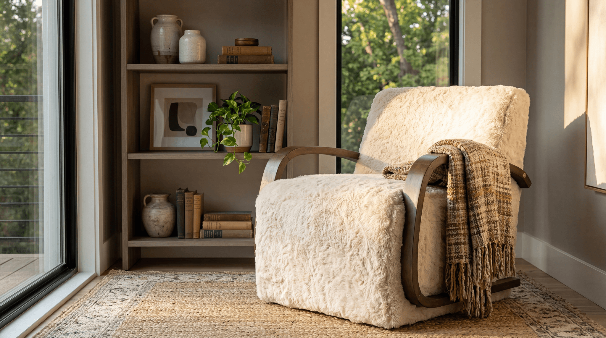
Sometimes you fill them with dried botanicals, but plenty look complete on their own.

Flower Vases

A great flower vase for home use does two things at once: it supports the stems and holds the right water depth so your blooms last longer. According to ScienceDirect, vase life is shaped directly by water uptake and stem condition, so the vessel you choose actually matters.

That means your blooms should guide the shape:

  • Tall, narrow vases for long stems like roses or lilies.
  • Wide-mouth bowls for full bouquets, such as peonies or hydrangeas.
  • Bud vases for single tulips or short-stem florals.

Storage Jars

Functional pieces can still earn their place on display, and storage jars are the proof.

You can use them in the kitchen for utensils and dry goods, in the bathroom for cotton rounds, and on your desk for office supplies. The trick is choosing finishes that match your decor, so the function quietly disappears into the styling.

Floor Vases

Once you move past tabletop pieces, floor vases become the next layer. These statement-sized vessels belong in corners, entryways, and beside large furniture, where they add height without competing with the art on your walls.

You can fill them with:

  • Tall branches for organic texture
  • Faux florals for year-round impact
  • Nothing at all, if the silhouette is sculptural enough

Bud Vases

Bud vases are the smallest pieces in the family, yet they often deliver the biggest impact. You can slip one onto a nightstand, line three across a dining table, or cluster five on a coffee tray. Since their scale is so forgiving, you get to experiment with arrangements you would not attempt in larger pieces.

Choosing the Right Material for Vases and Jars

White ceramic vase for home decor styled with dried bunny tails and books on a built-in shelf

Once you know the categories, the material is your next call. A glass vase for home decor disappears into a styled shelf, while a ceramic vase for home decor anchors a console with weight.

Glass Vases and Jars

Clean, modern, and quietly versatile. Glass vases for home decor let you see stems and water, which adds movement to the arrangement.

Clear glass disappears when you want the flowers to lead, while colored or smoked glass becomes a sculptural piece in its own right. You can layer different shapes without them visually competing.

Ceramic and Porcelain

Durable, weighty, and full of character. A ceramic vase for home decor brings warmth that glass cannot match, especially in handmade or hand-glazed finishes.

You will find ceramics in nearly every color, from soft cream to deep midnight, and in matte or glossy finishes.

Porcelain reads more refined and suits classic interiors, while artisanal ceramic feels right at home in modern, organic, or boho spaces. According to Britannica, pottery is one of the oldest decorative arts, with earthenware dating back about 9,000 years, which is part of why ceramics still feel timeless in your space today.

Metal Vases

Bold and architectural. Brass, brushed nickel, and matte black metal vases pair best with contemporary and industrial interiors, where their reflective or rough surfaces add tension to the softer materials in your room.

Wood and Natural Materials

Warm, earthy, and grounded. Wood, woven, and natural-fiber vessels feel right in rustic, boho, and Japandi spaces. Most work as sculptural pieces rather than functional flower holders, since the materials are not always water-tight.

The same logic applies to other big pieces in your home, where frame, fabric, and scale matter as much as material and proportion do when picking your vases and jars.

How to Choose the Right Size and Shape

Scale is where most beginners stumble. A beautiful vase set on the wrong surface looks awkward, no matter how well-made it is. Use these rules to keep your proportions clean:

  • For tabletop pieces, your vase should be no taller than two-thirds the height of the tallest nearby object, including lamps and frames.
  • For floor vases, give yourself at least 18 inches of clearance on either side so the piece reads as intentional rather than crammed in.
  • For floral arrangements, the stems should be 1.5 to 2 times the height of the vase. This ratio keeps blooms evenly distributed throughout the vessel.

Shape matters too. Tall, narrow vases visually lengthen a space, which is especially helpful in low-ceilinged rooms. Wide, bulbous shapes ground a surface and balance taller objects nearby.

Matching Vases and Jars with Interior Styles

Distressed black ceramic vase styled on a wood console against a white brick wall

After material, the next layer is style. The vases and jars you bring home should reinforce your room’s mood, not fight it. Mismatched pieces create visual noise, while well-paired ones make the whole space feel intentional.

That is why matching decorative jars and vases to your interior style matters more than chasing trends. The right pairing pulls a room together in seconds.

Modern and Minimalist

Look for clean silhouettes, neutral colors, and quiet finishes. Skip the heavy ornamentation. In this style, a single sculptural piece often does more work than a cluster of busy ones, so let one vase for home decor carry the moment.

Boho and Rustic

Texture is everything here. Hand-thrown ceramics, woven jars, terracotta, and uneven glazes all work beautifully together. You can mix shapes more freely, too, since the style invites collected, lived-in arrangements that feel gathered over time.

Since boho leans on the wall-and-shelf interplay, your vases and jars rarely sit alone. Pieces like abstract wall art on canvas carry visual weight above, while organic, textured vessels balance the eye on the surfaces below.

Classic and Traditional

Glossy finishes, symmetrical pairs, and elegant silhouettes lead the way.

Think porcelain, deep cobalt blues, and soft gilded accents. Pairs work especially well on consoles and mantels, where you want your decorative jars and vases to mirror each other and frame what sits between them.

Industrial and Contemporary

Metal, matte black, and concrete-look ceramics anchor industrial spaces beautifully. Look for vases with structured lines and intentional weight. The contrast between hard surfaces and soft botanicals is what brings your room to life.

Color and Finish: What Works Best

Color is your fastest tool for shifting a room’s mood, and finish does similar work behind the scenes. Here is how each plays out:

  • Neutrals (white, cream, soft black) blend with most palettes and let flowers lead.
  • Bold tones become statement pieces that anchor a shelf or table.
  • Glossy finishes reflect light and read polished.
  • Matte finishes absorb light and feel quiet.

When building a vase for home decor collection, keep two or three neutrals as your base and rotate bolder pieces by season.

Where to Place Vases and Jars in Your Home

After color and finish, placement is what turns your vases and jars from beautiful objects into intentional design choices. The same piece reads entirely differently depending on where you put it, so the room you place it in matters as much as the piece itself.

Living Room

Coffee tables, console tables, and built-in shelves all welcome vases and jars.

For coffee tables, keep heights low so they do not block sightlines across the room. Built-ins look best with grouped pieces of varying heights, while console tables behind sofas come alive with one taller vase paired with a smaller object.

Pieces like home decorative accents help you balance vases with sculpture, books, and lighting on the same surface.

Dining Area

Centerpieces are where your home flower vase earns its keep. Keep arrangements low enough that diners can see across the table, or go very tall (above eye level when seated) so they do not interrupt sightlines.

The awkward middle height is the one to avoid.

Bedroom

Soft, smaller pieces work best here. A bud vase on a nightstand or a single ceramic piece on a dresser keeps the room calm without crowding your visual field.

According to an Int J Environ Res Public Health study, even small natural elements like indoor plants and fresh flowers can improve relaxation, reduce stress, and support better sleep, which is why your bedroom rewards quiet decorative jars and vases more than bold ones.

Entryway

Make a statement. Your entryway sets the tone for your home, so taller floor vases or sculptural pieces work beautifully here. Pair them with a console, a mirror, and a single light source for a layered look you can refresh seasonally without replacing the anchor pieces.

How to Style Vases and Jars Like a Pro

Bronze ceramic vase with magnolia branches styled on a traditional mantel with vintage clock

The way you arrange vases and jars matters as much as which ones you pick. A few small principles will give your styling a polished, intentional feel, no matter the room you place them in.

With Flowers and Greenery

Match your arrangement to the vase shape, since the vessel sets the rule for what fits inside.

  • Wide-mouth ceramic vases call for full, structured arrangements.
  • Narrow glass vases look best with single stems or thin clusters.
  • Mixed dried and fresh stems add texture without weekly maintenance.

Layering and Grouping

Odd numbers feel more natural to the eye than even ones, which is why the rule of threes carries across landscape and interior design alike. To put it to work in your space:

  • Group two or three pieces of varying heights.
  • Keep at least one shared element (color, material, or finish) to make the cluster read as cohesive.
  • Avoid perfect symmetry, since the eye wants a little tension.

The same proportion logic shows up in trade publications that interior designers rely on for client work.

Using as Standalone Decor

Sometimes a single sculptural vase is enough.

A statement floor vase in your entryway corner or a striking ceramic piece on a side table can carry the styling on its own, especially when the vase or piece has an interesting form, texture, or color worth featuring.

According to House Digest, unusual shapes and one-of-a-kind silhouettes function as art objects in themselves, so the vase becomes the focal point rather than a backdrop.

Top 10 Vases and Jars for Your Space (Buyer’s Picks)

Across materials, scales, and styles, these ten Sagebrook Home pieces cover the most common decorating problems you will face.

You can mix and match them or use any one as the anchor for a new shelf or surface.

Vase/Jar #1: 30″ Terracotta Floor Vase, Ivory

When a corner feels empty but a piece of furniture would crowd it, this is the answer. The ivory terracotta brings warmth without competing for attention, which is why it works in almost every neutral palette.

  • Best For: An entryway corner, an empty stretch beside a sofa, or any space where you want vertical interest at floor level.
  • Key Features: Ivory terracotta in a warm, hand-shaped silhouette. Floor-scale presence that fills negative space without feeling heavy.
  • Shop the piece: 30″ Terracotta Floor Vase, Ivory

Vase/Jar #2: 40″ Terracotta Floor Vase With Handles, Ivory

If your room has high ceilings or a soaring entryway, a 30-inch vase can feel undersized. This 40-inch sibling fixes that, since the extra height plus sculptural handles give your space the proportion it actually wants.

  • Best For: A double-height foyer, a tall hallway, or any space where ceilings climb and standard floor vases get lost.
  • Key Features: 40-inch ivory terracotta with sculpted handles. Statement scale that holds its own beneath tall ceilings or large-format wall art.
  • Shop the piece: 40″ Terracotta Floor Vase With Handles, Ivory

Vase/Jar #3: 16×10″ Terracotta Vase, Distressed Black

Black with patina is one of the hardest finishes to get right, since it can read flat or feel too new. This piece earns its character honestly, which makes it work in collected, layered rooms without feeling forced.

  • Best For: A statement console, a dining buffet, or a shelf where you want texture and a touch of patina.
  • Key Features: Distressed black finish on terracotta with a weathered, lived-in feel. Adds depth to neutral palettes without going moody.
  • Shop the piece: 16×10″ Terracotta Vase, Distressed Black

Vase/Jar #4: 16×10″ Terracotta Vase, Brown Ombre

Ombre finishes do something straight colors cannot, since the gradient gives the eye somewhere to travel. The brown range here keeps things grounded while still adding visual movement to a styled surface.

  • Best For: A console, a built-in shelf, or any space leaning warm-toned and earthy.
  • Key Features: Terracotta with a soft brown-to-cream ombre finish. The gradient adds depth without competing with surrounding decor.
  • Shop the piece: 16×10″ Terracotta Vase, Brown Ombre

Vase/Jar #5: 30″ Terracotta Floor Vase, Rustic Black

Black floor vases are rarer than ivory ones for a reason. They demand a confident space, and this one rewards that confidence with sculptural weight and a finish that beautifully grounds darker palettes.

  • Best For: A modern or industrial-leaning room that calls for a darker, sculptural floor anchor.
  • Key Features: Same 30-inch floor scale as the ivory version, finished in rustic black for spaces that lean toward a moodier or more contemporary aesthetic.
  • Shop the piece: 30″ Terracotta Floor Vase, Rustic Black

Vase/Jar #6: 14″ Traditional Terracotta Vase, Terracotta

This is the workhorse of the collection. The classic terracotta tone pairs with almost everything, and the silhouette holds its own whether you fill it with eucalyptus, dried wheat, or nothing at all.

  • Best For: A boho or Mediterranean-leaning shelf, an open kitchen ledge, or a relaxed mantle.
  • Key Features: Classic terracotta finish with a balanced silhouette that works as a flower vase for home arrangements or styled empty.
  • Shop the piece: 14″ Traditional Terracotta Vase, Terracotta

Vase/Jar #7: 12×8″ Terracotta Vase, Brown Ombre

Sometimes you need the same finish at a smaller scale, since not every surface can hold a 16-inch piece. This compact ombre version gives you the same warmth on side tables, nightstands, or open shelving where space is tighter.

  • Best For: A nightstand, a side table, or a built-in shelf where you want texture in a compact silhouette.
  • Key Features: Smaller-scale terracotta in a brown ombre finish. Sized for grouped arrangements and tighter surfaces.
  • Shop the piece: 12×8″ Terracotta Vase, Brown Ombre

Vase/Jar #8: 12×10″ Rustic Terracotta Vase With Chain, Black

Sculptural details are what separate good vases from forgettable ones, and this one earns its keep with the chain accent alone. The piece feels intentional even before you style anything around it.

  • Best For: A console, an entry table, or a shelf where you want a piece with sculptural detail.
  • Key Features: Black terracotta body with a rustic chain accent. Adds character to neutral palettes and pairs well with nearby woven and wood textures.
  • Shop the piece: 12×10″ Rustic Terracotta Vase With Chain, Black

Vase/Jar #9: 16×9″ Terracotta Textured Jug Vase, Gold

Metallic finishes on terracotta are unexpected in the best way. The gold here reflects light at a different angle than ceramic or glass would, which is exactly what some shelves need to come alive after dark.

  • Best For: A shelf or console that needs a metallic accent, especially in spaces with lamp lighting or candles nearby.
  • Key Features: Textured terracotta jug silhouette in a warm gold finish. A vase for home decor that doubles as a quiet light reflector.
  • Shop the piece: 16×9″ Terracotta Textured Jug Vase, Gold

Vase/Jar #10: 18×9″ Terracotta Floor Vase, Black

Not every floor vase needs to be tall to make a statement. This shorter black silhouette anchors a corner without dominating it, which is what most rooms actually need when adding floor-scale decor.

  • Best For: A modern living room corner, a hallway anchor, or a contemporary entryway where you want a low-profile floor piece.
  • Key Features: Black terracotta in a compact floor-scale silhouette. Sized to anchor a corner without dominating the room.
  • Shop the piece: 18×9″ Terracotta Floor Vase, Black

Common Mistakes to Avoid When Buying Vases and Jars

Even seasoned shoppers slip on these, since most of the mistakes feel small until you live with them. Catch these early as you build your collection:

  • Buying too small for the room: Undersized vases and jars disappear on a shelf, so when in doubt, scale up.
  • Ignoring water-tight construction: Some decorative pieces need a glass insert before you can use them as a real flower vase for home arrangements.
  • Overcrowding the surface: Negative space matters as much as the objects themselves, so resist filling every inch of a console or shelf.
  • Mixing too many materials in one cluster: Stick to two materials per grouping (for example, ceramic + glass), since more than that reads chaotic.
  • Forgetting maintenance: Glass shows water marks, ceramics chip, and metal can tarnish, so pick materials your real life can support.

Why Choose Sagebrook Home for Vases and Jars

Sagebrook Home has built its reputation on wide selection, trend-forward design, and quality you can feel in your hands. The vases collection covers glass, ceramic, and metal silhouettes for every room, while the jars collection handles storage and decorative pieces from rustic to refined.

Beyond retail, the brand also serves designers and stockists, which means consistent stock, fast fulfillment, and a catalog deep enough to outfit entire projects. If you buy for a business, wholesale pricing makes the math work at scale.
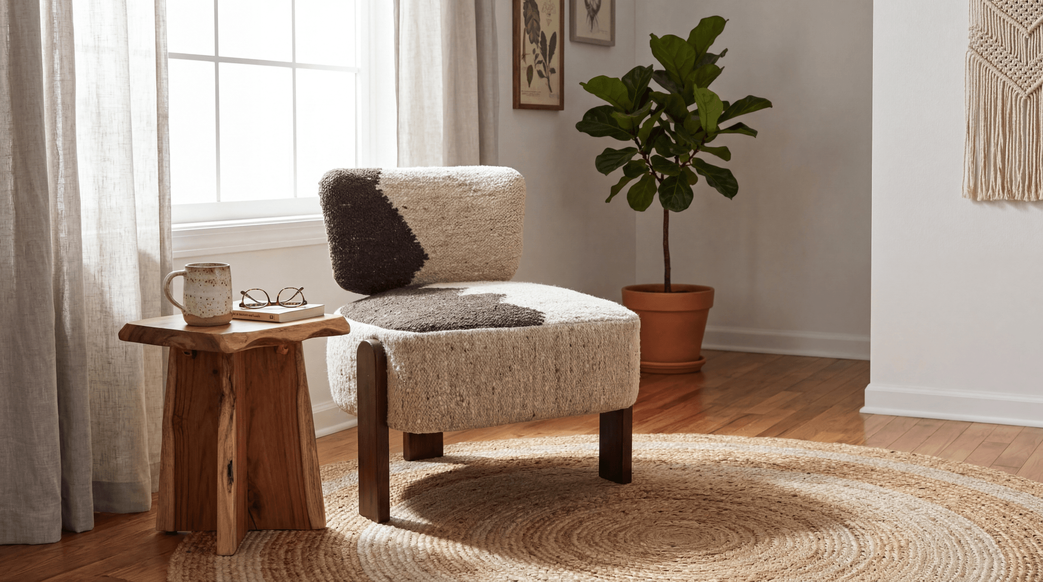
So whether you are styling one shelf or sourcing for clients, you have a starting point that grows with you.

Ready to Style Yours?

Black-and-white ombre ceramic vase for home decor styled on a wood console with abstract wall art

Choosing vases and jars is less about rules and more about training your eye. Match material to mood, scale to surface, and shape to setting, and your styling stops feeling like guesswork.

When you treat these pieces as the foundation of your decor instead of afterthoughts, your whole room comes together with less effort. The right vase carries color, texture, and personality at the height where they register most.

Want to see the pieces in person before you commit? Visit a Sagebrook Home showroom to find the ones that best fit your space.

FAQs

What size vase should I choose for my coffee table?

For coffee tables, pick a vase for home decor no taller than two-thirds the height of nearby lamps or framed art. A 10 to 14-inch piece hits the right balance, anchoring the surface without blocking sightlines across the room.

Are glass vases or ceramic vases better for fresh flowers?

Both work, but they read differently. Glass vases for home decor showcase stems and water for minimal, modern arrangements, while ceramic vases for home decor hide stems and add weight, which suits fuller, structured bouquets best.

How many vases and jars should I display together?

Group decorative jars and vases in odd numbers, usually three or five, for the most natural look. Vary heights, share at least one material or color across the cluster, and leave breathing room so each piece reads clearly.

Where can I find quality flower vases for home use?

Sagebrook Home offers a wide range of flower vase for home options across glass, ceramic, and metal. The catalog covers bud vases to floor vases, with pieces that fit modern, traditional, boho, and industrial spaces alike.

How do I clean ceramic and glass vases without damaging them?

For glass, use warm water with a drop of dish soap and a bottle brush. For ceramics, hand-wash with mild soap and skip abrasive sponges that scratch glaze. Air-dry both upside down to prevent water spots.

Categories
Uncategorized

Chair Buyer’s Guide: How to Choose the Right Chairs For Your Space

Chair Buyer’s Guide: How to Choose the Right Chairs For Your Space

Apr 24th 2026

Brown and ivory textured accent chair with dark wood legs styled in a cozy living room corner with a jute rug, wooden side table, and fiddle leaf fig plant

Most people choose chairs based on looks alone. That’s a mistake. The best chairs for home balance comfort, durability, and design. The right pick depends entirely on how you’ll use the space.

Not every room needs the same seat. Understanding the types of chairs for living room layouts versus dining or office setups changes everything. Shape, height, and material. Each detail shapes how a chair performs day after day.

This guide breaks down what actually matters. At Sagebrook Home, we design chairs that merge style with function for retailers, designers, and hospitality professionals who refuse to compromise.

Key Takeaways

  • The best chairs for home balance comfort, function, and visual design. The strongest choices excel at all three.
  • Different rooms call for different types of chairs for living room relaxation, modern dining chairs for daily use, and comfortable office chairs for ergonomic support.
  • Material selection drives longevity and aesthetics. Wood, metal, upholstery, and mixed materials each bring distinct character.
  • Always measure your space before purchasing. Proportion makes the difference between a chair that fits and one that overwhelms.
  • Knowing how to choose chairs means coordinating style through finish, color, and silhouette rather than buying in isolation.

Why Choosing the Right Chairs Is Important

You sit in a chair every day. Yet most people overlook how that contact affects their body over time. Poor seating quietly damages posture, drains energy, and contributes to spinal issues. A systematic review in Heliyon confirmed that ergonomic chair design directly reduces musculoskeletal disorders.

Beyond comfort, chairs carry serious visual weight. They’re often the first piece your eye lands on. A well-chosen chair anchors a room. A poor one disrupts it.

That’s why construction matters equally. Solid joinery and quality materials deliver years of reliable use, making the right chair a smarter long-term investment than cheaper alternatives that sag within months.

Types of Chairs You Should Know

Ivory faux fur accent chair with sleek black angular legs placed beside a modern dark wood vanity table in a minimalist bedroom

Living Room Chairs

Your living room is where chairs define a space most. 

The types of chairs for living room settings include accent chairs, lounge chairs, and armchairs. Each creates a different energy. A sculptural accent piece becomes a focal point, while a deep lounge chair invites relaxation.

However, looks alone aren’t enough. If a chair feels rigid, you won’t sit in it. The best living room picks earn their place in both comfort and style.

Dining Chairs

Modern dining chairs need to match your table height, which typically sits between 28 and 30 inches. Your chair seat should land around 17 to 19 inches for a comfortable gap between your thighs and the table’s underside.

Options vary widely. Simple wooden side chairs offer clean lines, while fully upholstered designs bring comfort to longer meals. Bench seating adds a casual, space-efficient alternative. Just keep in mind that upholstered dining chairs require more careful material selection to handle spills.

Office Chairs

Comfortable office chairs are the backbone of any productive workspace. Ergonomic task chairs, executive models, and adjustable designs all support your body during long hours. What matters most is adjustable seat height, lumbar support, and armrests that position your wrists without strain.

As ChairKey notes, proper ergonomic design distributes pressure evenly and reduces fatigue during prolonged sitting. If you work from home, investing in a truly supportive chair is one of the smartest decisions you can make.

Bedroom Chairs

Bedroom chairs play a lighter role compared to living room or office seating, but they add real value. A vanity chair at your dressing table, a reading nook piece, or a small accent at the foot of your bed all introduce personality beyond just sleeping.

Because you typically use them for shorter periods, style can take priority over deep ergonomic support. This is where sculptural designs, bold fabrics, and statement silhouettes truly shine.

Outdoor Chairs

Outdoor seating demands materials that withstand weather, UV exposure, and temperature swings. Patio chairs, lounge designs, and foldable options built from aluminum, resin wicker, teak, or weather-resistant synthetics hold up season after season.

Even so, comfort still matters outside. Lounge chairs with cushioned seats, Adirondack designs with contoured backs, and dining chairs with breathable mesh all deliver outdoor comfort without sacrificing durability. 

The key is choosing materials that perform well in your specific climate.

Key Factors to Consider When Buying Chairs

Plush white faux fur accent chair with dark wood legs positioned at the foot of a bed in a bright, airy bedroom setting

Ergonomics

Your body notices a bad chair before your eyes do. 

Seat depth, back angle, and armrest placement all shape how you feel after extended use. A seat that’s too deep forces you to slouch. A back that’s too upright creates lower spine tension.

The ideal chair supports your natural curves while allowing slight postural shifts throughout the day. If you plan to sit in it for more than 30 minutes, ergonomic design isn’t optional. It’s the baseline.

Size and Dimensions

Always measure your space before you shop. A chair that looks proportional online can feel oversized once it arrives. Start by checking seat height relative to your table or desk. Then confirm overall width, including armrests, so it fits beside other furniture without crowding.

Depth matters too. A chair that blocks walkways or overwhelms a small room disrupts the entire layout. Beyond fit, consider proportion. A delicate chair next to a massive sectional looks out of place. Scale your chairs to their surroundings.

Material and Durability

The material you choose determines how long your chair lasts, how much care it needs, and how it looks over time. 

As Galstian Furniture explains, wood delivers timeless beauty and structural strength, metal offers modern durability with minimal upkeep, and fabric adds comfort but demands more regular care.

Each option involves trade-offs. Understanding them helps you pick a material that matches your lifestyle, not just your aesthetic.

Style and Design

Your chair should speak the same design language as the room around it. 

A sleek, low-profile modern piece feels out of place in a traditional setting. Similarly, an ornate wingback looks awkward in a minimalist studio.

Start by matching the chair’s silhouette and finish to your room’s dominant theme. Then use texture and accent color to add subtle contrast. That layered approach creates personality without visual tension.

Functionality

Not every chair needs to sit still. Swivel chairs give you mobility in an office. Recliners offer adjustable comfort for a living room. Stackable options save space in dining and commercial settings, while foldable chairs store flat when you don’t need them.

Before you buy, consider how you’ll actually use the chair day to day. That function should guide which features matter most, not just the way it looks.

Chair Materials Explained

The material you choose affects how your chair looks, lasts, and how much care it needs. Here’s what each option offers.

  • Wood: Hardwoods like oak and walnut deliver timeless strength across traditional and modern settings. They require occasional moisture care but reward you with decades of use.
  • Metal: Steel and aluminum frames bring industrial durability with minimal upkeep, making them ideal for high-traffic spaces.
  • Upholstered: Fabric, velvet, and leather add warmth and comfort instantly. However, they demand regular cleaning to stay fresh.
  • Plastic and Acrylic: Lightweight and easy to clean, these suit casual, outdoor, or commercial settings where practicality comes first.

How to Choose Chairs for Different Spaces

Chairs for Small Spaces

When space is limited, every piece needs to earn its footprint. Compact armless chairs, foldable options, and designs with slender legs all help a room feel more open. Light colors and minimal silhouettes reinforce that sense of spaciousness.

Versatility matters here too. A chair that works at your desk, dining table, and vanity gives you flexibility that single-purpose pieces simply can’t match.

Chairs for Large Spaces

Generous rooms give you the freedom to go bigger and bolder. Statement accent chairs with wide arms, deep seats, and dramatic upholstery become natural anchors in a large living area.

To keep things visually interesting, try mixing styles. Pair an upholstered armchair with a sleek metal-framed side chair for contrast. Just make sure you scale your seating proportionally to the surrounding furniture so nothing looks lost in the space.

Chairs for Commercial Spaces

Hotels, restaurants, and co-working environments need chairs that balance durability with consistent design. Materials should withstand heavy daily use and clean easily, while silhouettes align with the brand’s visual identity.

For designers and retailers sourcing at scale, wholesale interior design solutions offer the variety and volume needed to furnish large projects without compromising on style.

Top 10 Chairs for Every Space (Buyer’s Picks)

Ivory faux fur accent chair with curved wooden arms and a draped plaid throw blanket in a sunlit reading nook beside a bookshelf

Now that you know what to look for, here are ten standout options worth considering. 

This curated selection from the Sagebrook Home chairs collection brings together accent chairs, swivel designs, and statement pieces that work across living rooms, bedrooms, offices, and guest spaces. 

Each pick balances the comfort, style, and versatility you need to make a confident choice.

1. 27×26″ Textured Accent Chair in Brown/Ivory (23372)

If you want layered warmth without overwhelming a room, start here. The brown and ivory woven fabric gives this chair a rich, textured feel that fits naturally into transitional, bohemian, and farmhouse interiors.

At just 27×26″, it’s compact enough for smaller living rooms and bedrooms. That makes it especially useful for reading corners and styled nooks where you need visual interest without sacrificing space. 

View the 27×26″ Textured Accent Chair in Brown/Ivory

2. 27×34″ Faux Fur Accent Chair in Ivory/Black (#23366)

This chair brings instant luxury to bedrooms, vanity areas, and styled living room corners. 

The soft faux fur in ivory paired with sleek black legs reads as glam and contemporary at the same time.

It also features a knock-down design, which simplifies both assembly and delivery. Whether you use it as a statement piece or a functional accent, it adds a tactile richness that elevates the entire room. 

View the 27×34″ Faux Fur Accent Chair in Ivory/Black

3. 35×29″ Faux Fur Accent Chair in White (#23315)

For a bold, plush option, this all-white faux fur chair makes a statement. The generous 35×29″ dimensions give you genuinely lounge-worthy seating that feels as comfortable as it looks.

Its bright white palette keeps things clean and airy, making it a strong fit for primary bedrooms, guest rooms, and modern living spaces. If you want a piece that commands attention while still inviting you to sit and stay, this one delivers. 

View the 35×29″ Faux Fur Accent Chair in White

4. 32×31″ Faux Fur Accent Chair in Ivory/Brown (#23185)

This chair balances warmth and versatility in equal measure. The ivory and brown faux fur upholstery grounds it in a neutral palette that pairs with virtually any color scheme you already have.

At 32×31″, the proportions offer both comfort and visual presence without dominating the room. It works naturally in living rooms, bedrooms, and styled office corners, making it one of the most adaptable options in the entire collection. 

View the 32×31″ Faux Fur Accent Chair in Ivory/Brown

5. 32×30″ Modesto Accent Chair in Ivory/Brown (#23183)

The Modesto strikes an approachable balance between structured and relaxed. 

Its clean-lined ivory and brown upholstery gives you visual warmth without feeling overly casual, which makes it a natural fit for living rooms and sitting areas.

At 32×30″, it suits standard-sized rooms comfortably. What also sets it apart is its crossover appeal. This chair works equally well in residential settings and hospitality projects where polished versatility matters most. 

View the 32×30″ Modesto Accent Chair in Ivory/Brown

6. 33×30″ Warren Accent Chair in Ivory/Brown (#23181)

The Warren offers something the others don’t: a slightly taller back for enhanced upper-body support. 

That detail makes it especially comfortable in reading nooks, formal living rooms, and guest rooms where you sit for longer stretches.

Its ivory and brown upholstery keeps the look polished yet inviting. 

The classic-meets-modern silhouette also blends naturally into traditional and transitional interiors, giving you a chair that supports both your body and your room’s design. 

View the 33×30″ Warren Accent Chair in Ivory/Brown

7. 33×31″ Modern Swivel Rocker Chair in Gray/Black (#23180-02)

This is the chair you’ll reach for throughout the day. The swivel and rocking mechanism adds dynamic mobility that static chairs simply can’t match, making it ideal for home offices, nurseries, and living rooms.

Gray fabric with a black base gives it a clean, contemporary look. At 33×31″, it fits both open rooms and compact corners. If you need a chair that moves with you rather than sitting idle, this is your pick. 

View the 33×31″ Modern Swivel Rocker Chair in Gray/Black

8. 33×31″ Modern Swivel Rocker Chair in Tan/Brown (#23180-01)

If you prefer warmer tones, this version delivers the same swivel and rocker functionality in a tan and brown colorway. It pairs naturally with wood furniture and earthy neutral interiors.

The relaxed modern design invites long, comfortable sitting, which makes it a strong choice for living rooms and bedrooms alike. You get the same dynamic mobility as the gray version, just wrapped in a palette that feels grounded and organic. 

View the 33×31″ Modern Swivel Rocker Chair in Tan/Brown

9. Rounded Cane Back Swivel Accent Chair in Ivory/Tan (#21641)

The cane back detail is what sets this chair apart. It adds natural texture and visual depth that elevates the design beyond a standard swivel chair into genuinely interesting furniture.

Ivory upholstery with a warm tan cane accent creates a refined, layered look. 

The swivel base also gives you flexible positioning in any room. If you’re styling a living room, bedroom, or office and want something with real character, this delivers effortlessly. 

View the Rounded Cane Back Swivel Accent Chair in Ivory/Tan

10. Burl Wood Arm Swivel Accent Chair in Ivory/Tan (#21640)

This is the collection’s true statement piece. The burl wood arms introduce a high-design material detail that signals luxury and craftsmanship the moment you see it.

Ivory upholstery with tan accents keeps the palette warm and grounded, while the swivel mechanism adds modern functionality. It works beautifully in living rooms, reception areas, and premium residential projects. 

If you want one chair that anchors an entire room, this is the one to choose.

View the Burl Wood Arm Swivel Accent Chair in Ivory/Tan

How to Match Chairs with Your Interior Style

Your chair should feel like it belongs, not like an afterthought. Here’s how to align your pick with the most popular design directions.

  • Modern: Clean lines, low profiles, and neutral palettes. Stick with metal and molded forms while avoiding ornate details.
  • Traditional: Turned wood legs, rolled arms, and rich upholstery. Symmetry and classic proportions are key.
  • Bohemian: Mixed textures, bold colors, and unconventional shapes. Rattan, cane, and layered textiles reinforce the look. Exploring boho home decor sourcing helps you layer that aesthetic beyond the chair itself.
  • Industrial: Metal frames, distressed finishes, and raw materials. The wood and metal pairing defines this style.

When mixing styles, use your chair as the contrasting element. A modern piece in a traditional room adds edge, while a classic chair in a minimalist space brings warmth.

Common Mistakes to Avoid When Buying Chairs

Even experienced buyers make avoidable errors. Knowing what to watch for saves you time, money, and frustration.

  • Ignoring measurements: A chair that’s too wide, tall, or deep disrupts your entire layout. Always measure before you buy.
  • Choosing style over comfort: A stunning chair nobody sits in fails its purpose. Test seat depth and back support first.
  • Skipping material checks: Weak frames and thin upholstery mean faster replacement. Low price often means low durability.
  • Buying mismatched pieces: Unless you’re mixing intentionally, uncoordinated chairs create visual discord. Tie pieces together through finish, scale, or color.

You can avoid most of these pitfalls by sourcing from trusted suppliers. Working with partners who prioritize wholesale home decor quality ensures material integrity and design consistency from the start.

Why Choose Sagebrook Home for Chairs

At Sagebrook Home, we design chairs around what the market genuinely needs: trend-aware pieces that are well-constructed and available in the variety retailers and designers rely on. 

Our catalog spans accent chairs, swivel designs, lounge seating, and statement pieces across modern, transitional, glam, and bohemian styles.

Quality materials and thoughtful craftsmanship run through every piece. Fast fulfillment and dedicated support keep your projects moving smoothly. Whether you’re stocking a showroom or furnishing a hospitality space, our full chairs collection gives you the range to find exactly what you need.

Ready to Find Your Perfect Chair?

Ivory upholstered swivel accent chair with burl wood arms in an elegant living room with abstract art, arc floor lamp, and marble side table

The right chair balances comfort, durability, and visual harmony with your space. Now that you know what to look for, the next step is seeing these principles in action. 

At Sagebrook Home, our chairs collection brings trend-driven design and reliable craftsmanship together for retailers, designers, and hospitality professionals. Visit our showrooms and events to experience the quality firsthand.

FAQs

What are the best chairs for home use in living rooms?

The best chairs for home living rooms are accent and lounge chairs that pair deep comfort with your decor. Look for upholstered options with supportive backs and durable fabric in colors that complement your existing furniture.

How do you choose chairs that fit a small room?

Knowing how to choose chairs for small spaces starts with measuring carefully. Pick armless or compact designs with slim profiles and light upholstery. Avoid oversized silhouettes that overwhelm the room, and prioritize multi-purpose pieces instead.

What makes a good comfortable office chair for working from home?

Comfortable office chairs should include adjustable seat height, lumbar support, breathable fabric, and stable armrests. These features reduce strain during long sessions and protect your posture throughout the day, making them essential for any home workspace.

How do you match modern dining chairs with an existing table?

Modern dining chairs work best when the seat height sits around 17 to 19 inches for a standard 30-inch table. Match the chair’s finish and material to your table’s design language for a cohesive look.

How many types of chairs are there for a living room?

Common types of chairs for living room spaces include accent chairs, armchairs, lounge chairs, swivel chairs, and recliners. Each serves a different purpose, from decorative focal points to deep relaxation, so your choice depends on how you use the room.
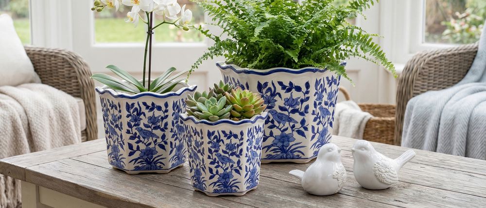
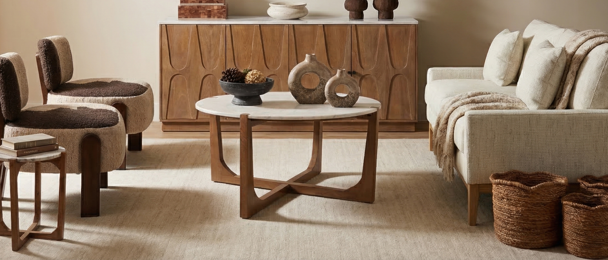
Categories
Uncategorized

How To Find The Best Home Lighting Designers For Your Space


Choosing the right home lighting designers is crucial for achieving the perfect ambiance in your living space. If you’re looking for experts who can guide you in selecting the best fixtures and designs to suit your style, here are the essential steps to consider.

What Should You Look For In Home Lighting Designers?

When searching for home lighting designers, keep these factors in mind:

  • Experience and Credentials: Look for professionals with a proven track record in lighting design. Check their portfolio and any certifications they possess.
  • Design Style: Make sure their design aesthetic aligns with your vision. Some designers might specialize in contemporary styles, while others may focus on traditional or minimalist designs.
  • Client Reviews: Research past client experiences to gauge satisfaction levels and the effectiveness of their designs.
  • Budget Understanding: A good designer should provide solutions that fit within your financial plan while maximizing value.

Why Is Professional Home Lighting Important?

Hiring a professional home lighting designer can significantly impact the functionality and aesthetics of your space:

  • Improved Aesthetics: A designer can blend different light sources to enhance architectural features and create focal points.
  • Functionality: Proper lighting design can improve the usability of each space, whether it’s brightening a workspace or creating a cozy reading nook.
  • Energy Efficiency: Designers can recommend the most energy-efficient options, helping you save on electricity bills.

How To Find Home Lighting Designers In Your Area

Once you understand what to look for, consider the following methods to discover top home lighting designers:

  1. Online Research: Using search engines with terms like “home lighting designers near me” will yield local options. Websites like Sagebrook Home provide valuable insights into designers in various regions.
  2. Referrals: Ask friends, family, or real estate agents for recommendations based on their experiences.
  3. Social Media and Online Platforms: Explore platforms such as Instagram or Pinterest for inspiration and contacts in your area. Many designers showcase their work here.
  4. Local Home Shows: Attend local home expos where you can meet lighting designers and view their work firsthand.

What Services Do Home Lighting Designers Offer?

Home lighting designers provide a range of services tailored to your needs:

  • Consultation: Initial meetings to explore your vision, requirements, and budget.
  • Design Plans: Developing detailed plans that outline where and how lighting will be implemented.
  • Product Recommendations: Guidance on selecting fixtures, bulbs, and other components that suit your design.
  • Installation Support: Coordination with electricians to ensure proper installation and functionality.

What Are The Benefits Of Hiring A Home Lighting Designer?

Here are the primary advantages of enlisting the help of a professional:

  • Expertise: Design professionals are aware of the latest trends and can introduce innovative ideas you might not have considered.
  • Time-Saving: Designers streamline the selection and implementation process, which can save you time and frustration.
  • Increased Property Value: Well-planned lighting can enhance your home’s worth by making it more appealing to potential buyers.

FAQs About Home Lighting Designers

How Much Do Home Lighting Designers Charge?

The cost can vary widely based on location, experience, and the complexity of the project. It is advisable to obtain quotes from several designers to compare expenses.

Do I Need A Home Lighting Designer For A Small Space?

Even small spaces can benefit from professional lighting design. Proper lighting can dramatically change the feel and function of any room.

How Can I Incorporate Natural Light In My Design?

Understanding how does the home’s design incorporate natural light can greatly affect your lighting choices and overall atmosphere.

Where Can I Find A Luxury Home Lighting Designer?

For high-end solutions, consider exploring resources on luxury home lighting design and services tailored to upscale residences.

In summary, finding skilled home lighting designers is crucial for realizing your vision. By following the guidance above, you’ll be well-equipped to select the right professionals who can enhance your living spaces significantly.

If you are also interested in optimizing your home decoration, visiting home decoration 3D supplier might be beneficial.

For a comprehensive guide, find out how to create an ambiance utilizing the home lighting interior design cheat sheet.

Categories
Uncategorized

How to Discover the Best Etsy Wall Art Illustration Abstract for Your Home Decor

Are you searching for the perfect piece of wall art to enhance your living space? The world of etsy wall art illustration abstract may have just the unique flair you need. With its distinct styles and diverse offerings, Etsy provides art lovers with endless inspiration for their home decor. Let’s dive into the details of what to look for when selecting abstract wall art from Etsy and how it can complement your home.

What Is Abstract Wall Art, and Why Is It Popular?

Abstract wall art moves away from conventional representation and focuses instead on colors, shapes, and forms. This modern artistic style captivates viewers by evoking emotion and thoughts without depicting literal subjects. Its popularity arises from:

  • Versatility: Abstract art can adapt to various design styles, from minimalist to bohemian.
  • Personal Expression: It allows individuals to showcase their personality through unique pieces.
  • Visual Interest: The bold colors and forms can serve as conversation starters in any space.

How to Choose the Right Etsy Wall Art Illustration Abstract for Your Space

Selecting artwork for your home can feel overwhelming, but focusing on key factors simplifies the process.

1. Consider Your Color Scheme

Your wall art should harmonize with your existing decor. Explore different color palettes, such as:

  • Abstract Yellow Gray Wall Art: Perfect for a contemporary touch.
  • Neutral Abstract Landscape Wall Art: Ideal for a calm and serene atmosphere.
  • Abstract Wall Art Colorful: Brightens up any space with vivid energy.

2. Evaluate Size and Scale

Size plays a crucial role in how art complements your space. Determine:

  • The dimensions of your wall.
  • Whether you want a large focal piece or a series of smaller artworks.
  • The spacing between art pieces if creating a gallery wall.

3. Understand Subject Matter

Abstract art can include various themes. Decide if you prefer:

  • Geometric shapes.
  • Fluid forms.
  • Color-based artwork that lacks definitive subjects.

Where to Display Your Abstract Art

Once you’ve chosen your perfect piece, consider ideal locations for displaying your etsy wall art illustration abstract.

  • Living Room: A striking piece can serve as a focal point above the sofa.
  • Bedroom: Artwork near the bed can create a soothing atmosphere.
  • Office: Inspiring art can enhance creativity and productivity.

How to Incorporate Etsy Wall Art Illustration Abstract in Various Styles

Integrating abstract art into your decor can enhance its aesthetic. Here’s how to do it:

1. Modern Minimalist

Choose pieces with clean lines and a limited color palette. A large abstract artwork can be your sole decorative element to maintain spaciousness.

2. Bohemian Style

Mix various abstract pieces with vibrant colors and textures. Layer your selection with woven textiles and natural elements for warmth.

3. Industrial Chic

Pair abstract art with raw materials like metal and wood. Opt for oversized artworks featuring bold colors to contrast with neutral backdrops.

Frequently Asked Questions About Etsy Wall Art Illustration Abstract

What should I look for in quality abstract wall art on Etsy?

Quality can be assessed by looking into the materials used, the artist’s portfolio, and reviews from other buyers. Choosing giclée prints or canvas options generally ensures durability.

Can abstract wall art fit in any home style?

Yes, abstract wall art is versatile enough to suit various decor styles. Its freedom of form and color allows it to blend harmoniously with traditional, modern, or eclectic designs.

How do I hang abstract art correctly?

For proper hanging, measure 57-60 inches from the floor to the center of your artwork. Consider spacing when hanging multiple pieces.

In summary, incorporating etsy wall art illustration abstract into your home decor can significantly impact its overall vibe. From creating a lively atmosphere to serving as the centerpiece of your room, the right piece of art can open up endless possibilities for personal expression. For more inspiration on how to choose and display popular abstract wall art, visit our detailed guide on popular abstract wall art.

Menu

Cart
New